Do you want to create a Responsive Mobile Menu for the WordPress site? Taking the recent developments in mind, There are around 5.16 billion unique mobile phone users in the world today. And this figure is growing rapidly.
In all these scenarios are you prepared and have the capacity to serve your audience using just mobile devices. Is your website�s menu easily accessible for mobile users? If not then there�s no need to worry. We will look into how can we easily create a Responsive Mobile Menu for your WordPress site that will be easily accessible across devices. Without any coding!
Why do we need a Mobile Menu for WordPress?
It�s not just about Mobile Users but others too. There are various other devices from which users can access our website. So, we need to make our website robust and convenient enough to handle various screen sizes. And that too without losing consistency and across devices. Responsive Mobile Menu makes it easier for users to navigate their way through the website.
Here we are going to make use of a WordPress Plugin called Responsive Menu. Responsive menu is a Highly customizable Responsive Menu Plugin for WordPress. It works with any device be it a Mobile Phone, Tablet, or Computer.
It has over 150 customizable options that you get with a combination of 22,500 options! No coding experience or knowledge is required. It has an easy-to-use interface. You can start creating what and can get it looked exactly as needed without any fuss.
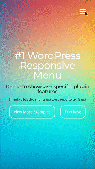
Check out this Live Responsive Menu Demo to have an understanding of what it actually does.
Step 1: Download the Responsive Mobile Menu for WordPress Plugin
So, to begin with, first, you need to download and install the plugin. To download the Plugin Click Here. Once downloaded login to the WordPress Admin Panel and go to Plugins Menu > Add New > Upload Plugin > Browse > Select the Plugin from the downloaded path and hit Install Now.
Step 2: Activate the Responsive Mobile Menu for WordPress Plugin
Once installed get it activated, by clicking on the �Activate� button in the Plugins menu. Once done, you will notice a new menu item labeled �Responsive Menu� is added to your WordPress admin panel. Click on the �Responsive Menu� and you will be presented with the Plugin�s Settings page called �Initial Setup�.
Step 3: Configuring the Responsive Mobile Menu for WordPress Plugin

First, you need to enter the width of the screen in pixels at which point you would like the plugin to start showing the hamburger button. By default, its value is set to 8000px you can change it to whatever value you like.
Next, you need to select what menu you want to show, click on the drop-down of �Menu to Use�, and select your menu. If there are no options appearing you need to make sure you have created the menus under Appearance > Menus or to create one Click Here.
The last option is to provide the CSS class to hide your current non-responsive theme menu. This is needed to hide the non-responsive menu from appearing in smaller Mobile Devices and replacing it with the new Responsive Menu.
Like this, there are various other customization options available in the Responsive Menu to beautify and enhance the appearance of the Responsive Menu across devices.
Step 4. Save and Watch the Responsive Mobile Menu for WordPress in Action
After making all the required customizations don�t forget to hit the Update Options button. And watch the Responsive Menu in action.
If you want further Advanced customizations like Header Bar, Desktop & Mega Menu, 15+ Button Animations, Keyboard Shortcuts, Preview Changes, Touch gestures, Icon Support, Colour Opacity, and more then you can purchase the license based on your requirements.
Check the Responsive Menu Pro Pricing
Still not tried Responsive Menu yet? Here�s a Quick Comparison of Responsive Mobile Menus for WordPress.