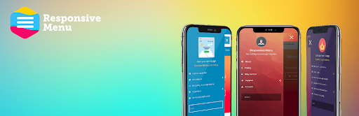
Add Flex Responsive Menu to WordPress Theme. 25th May 2022 By Vikas (admin) Add Flex Responsive Menu to WordPress Theme.