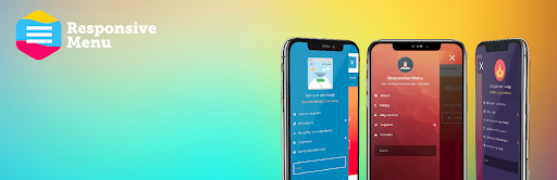
Make Responsive Navigation Menu in WordPress. 27th May 2022 By Vikas (admin) Make Responsive Navigation Menu in WordPress.