Do you want to know about the website navigation best practices? But, before beginning to learn the website navigation best practices, let�s know about the website navigation in detail.�
If you decide to follow the website navigation best practices, your website’s overall performance will increase, which will eventually be beneficial for you. Just following 5 practices and choosing a suitable website navigation design will work as wonders.
Not only that as a website’s prime focus is their clients, an amazing website navigation will keep them engaged in your website for a longer period of time as per every website owners wish. So, what are you waiting for? Make sure to read this informative article and make changes in your website’s navigation.
What is Website Navigation?�
Website navigation can generally be defined as looking through the resources on the web by clicking. This collection of user interface components enables users to find necessary content, information and feature of the website.�
Good website navigation is created/designed in such a way that users can receive the best out of it. The languages used in website navigation are extremely easy to understand, simple and up to point.��
Website navigation must have white space, colour changing options and many other design techniques that make it different from the other normal content. Generally, it is placed at the top and centre of the page or else on the left or right side of the page.�
The best function of a website navigation menu is that it allows the visitors, clients and customers of your website from one page to another without any kind of hassle.�
Now, we hope you have a clear understanding of the website navigation. So, without any further delay let�s get to know about the best website navigation designs available in the market.�
Best Website Navigation Design�
Website navigation plays an important role in driving traffic to your website and converting visitors into customers. The navigation menu impacts whether your visitors stay on your homepage and get engaged on your website or click the back button.�
Web design is versatile in nature and has many forms. However, some of its forms have only been able to gain more attention than others due to their amazing functionality and enriched features.�
Now, let�s get familiar with the list of best website navigation designs. Almost each and every design comes with its own pros and cons and it entirely depends on you which one will be suitable for your website.�
1. Horizontal Navigation�
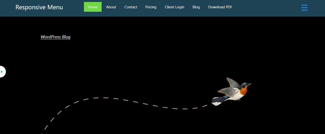
Horizontal Navigation is the most used website navigation design. This classic design is a combination of powerful functionality and usability. It is a list of links at the top of the page. Horizontal navigation is recommended for those users whose application requires global navigation that is always displayed at the top.�
2. Vertical Navigation�
Vertical Navigation is the best alternative to horizontal navigation. The design is situated at the side of the page and displayed up to down. This menu is suitable for those users who want unlimited menu expansion for their website. It is the most suitable option for mobile devices. Slack and Gmail are examples of applications that use vertical navigation.�
3. Landing�
A landing page is a single-page website that provides its users with infinite scrolling options. This website navigation is suitable for online stores, real-time websites and those websites which provide news services. It is suitable for websites that want to hold users’ attention through the infinite scrolling option.�
4. Fixed Navigation�
Fixed Navigation is also popularly termed a sticky navigation bar. This menu bar doesn�t disappear when you scroll down the page. It stays at the exact same place when the user scrolls throughout the web page. The best part about fixed navigation is that it enables its users to access the menu all time.�
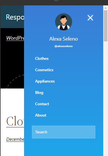
5. Hamburger Menu�
Hamburger Menu is a type of menu that has three parallel horizontal lines icon (?) It is named Hamburger as it takes the form of a famous sandwich. This menu is a very useful tool to incorporate into your app. Its simple design makes UI and navigation much cleaner. Also, it provides direct navigational access to its users. The hamburger menu easily hides a large number of options behind an icon.�
This is the list of 5 Best Website Navigation Design that you can use for your website. Besides, there are plenty of other navigation designs that you can use if any of the aforementioned navigation menus don�t meet your requirements.�
Website Navigation Best Practices
Once you choose a suitable website navigation design, you are all set to follow the website navigation best practices to make your website stand out among the competitors. Also, by practising the rules your website speed will be optimized and your website will rank at the top of different search engines.�
Make sure to go through the website navigation best practices that are followed by almost every website owner:�
1. Choose Menu Order Strategically�
The navigation menus are generally displayed on the website based on the goal of a website. Also, the website owners need to make sure that the menu strategies are designed and finalized before building a website.�
If you sell products, make sure that you have the product section at the top of the page. Similarly, if you provide services, note down the services in the navigation menu. Along with that make an arrangement of what comes first, second, and third based on the importance of the section.�
Menu order is really important as most statistics declare that visitors tend to pay more attention to sections mentioned at the header, footer and menus of different pages. By doing this you will be able to have a clear understanding of the design and development process.�
2. Descriptive Nature�
Descriptive labels are one of the website navigation best practices as it keeps the users engaged and are good for search engines as well. The navigation bar is visually appealing and informative so it is better for communication. It enables website owners to convey the prime information just with a glance.�
Including everything might make the menu less informative and more compact. Make sure that your navigation menu prioritizes a certain keyword which depicts the whole topic in short. Make sure to choose the labels that will increase the ranking and is relevant to different search engines.�
Despite trying to make your navigation menu of descriptive nature make sure that the titles have few words as possible. It is ideal for the owners to use one or two words.�
3. Use Mobile Responsive Navigation�
Most website and their navigation menus are super responsive when we use them on desktops or laptops. But, it might not be the same when you use it from your mobile devices. So, you need to make sure that your navigation menu is optimized, responsive and compatible with mobile devices as well.�
Users tend to visit different websites through mobile devices more as it is portable and within their access all the time. In order to meet with the user’s needs and provide them better facilities, make sure that your navigation menu and website are responsive across all devices.�
Make sure that your navigation menu is close-packed that fits well on the screen of mobile devices. Manage it in such a way that it doesn�t cause any sort of distortions of other buttons.�
4. Add a Search Bar�
The search bar enables users to find what they need more quickly and conveniently. Navigation can be clear across the entire site, whichever page they land on.�
When website visitors need to find a page they just need to type the word in the search bar and find it immediately without scrolling through the entire page. So, it will be a good idea for the website owner to add a search bar in their navigation menu to maintain the website navigation best practices.�
5. Make Navigation Menu Visible�
In a lot of cases, designers tend to sacrifice the visibility of the navigation menu in order to make their website creative and visually appealing. But, if you think wisely there is a more efficient use of a navigation menu only when it is visible to the users.�
Make sure that your navigation menu is visible on the website by making the correct placement that will be suitable for the visitors, clients and users. Another suitable way to make the navigation menu visible is by contrast. You can use colour contrast to access the visibility and accessibility of your website navigation.�
Responsive Menu
In order to make sure that you are following the aforementioned website navigation best practices, you need to get a highly customizable WordPress Menu Plugin. In WordPress no matter what you are trying to do �there is a plugin for that�� So, get yourself a plugin that will make your website�s menu more responsive, functional, complete and systematically organized.�
The worst part about finding a WordPress plugin is that almost every owner claims their product to be the best one. In this scenario, you might get a little confused. In order to help you out, our active research team has tested and analyzed hundreds of WordPress plugins and found the best one, Responsive Menu. Make sure to go through the description of the plugin.�
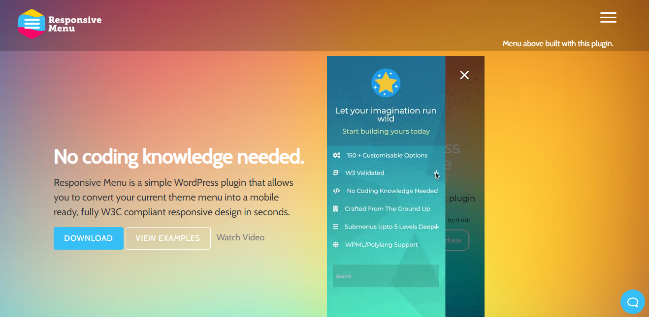
Responsive Menu is an amazing WordPress Plugin that enables you to create a mobile-friendly menu in no time. This plugin is highly customizable and user-friendly so don�t worry even if you are a WordPress beginner while using this plugin. Users can add menus to tables in the most appropriate and functional way using this plugin. Additionally, you will get 150 customisable options along with a combination of 22,500 options so you can make your website look as you want.�
Even if you are a beginner there is nothing much to worry about as this plugin doesn�t need any kind of coding skill. Just use an easy to use interface and make your menu look exactly as you want with minimum fuss. Its enriched features will meet each and every requirement to create a menu as per the client�s needs. Also, you can convert your current theme menu into a mobile-ready, fully W3C compliant responsive design in seconds using this plugin.�
Major Features of Responsive Menu:�
- Fully W3C Compliant Responsive Design
- Desktop and Mega Menu
- 20+ Button Animation
- Multi-Lingual Site Ready
- Touch Gestures and Keyboard Commands
- 30+ Color Options
- Disable Background Scrolling
- Includes Custom CSS Option
- Extensive Collection of Documentation and FAQ Sections
Wrapping Up:�
We hope this article helped you to learn the website navigation best practices. Following these best practices, you can make your website and its menu stand out among the competitors. This will eventually drive more traffic to your website and create a positive impact on the overall performance of your website.�
Finally, if you have any confusion while reading the entire content of this article, let us know about it in the comments section below. We would be happy to help you throughout. Also, do let us know what you think about the Responsive Menu Plugin.�