In this article, we are going to talk about an element of web design – the �accordion menu.� Multiple web design elements are used to create a stunning website. However, not every design element suits a certain brand website and provides the best user experience. A better user experience means providing a clean, simple, and easy navigation to anywhere on a website.�
An accordion menu makes it easier for users to navigate and know in gist about the information they will find on the website. You will best find it in the site�s FAQ and the navigation menu bar. So, to know more in detail, let�s read the following article.�
What is an accordion menu?
An accordion menu is a collapsable vertically stacked list of headers that can be clicked to reveal or hide further contents or sub-menus under the categories. In simple words, it is a web design element that expands in place to expose hidden information. Unlike overlays, the accordion menu doesn�t superimpose at the top of page content, instead pushes the page content down.�
In theory, it is a useful way to present content by allowing people control over the content by expanding and deferring them, the information feels less overwhelming. Using accordions on desktops might be debatable, however, this design element is of great use on mobiles. As, on mobile devices, the common problem users face is the display of too much content on small screen space. Accordions come useful, it exposes content to users in a progressive manner. If you click on a new panel, other menu items collapse.�
Benefits of applying accordion menu
Every element in web design has both its pros and cons however, that should not let you stop them from using it. Let�s look into a few advantages of using an accordion menu on your website.�
- One of the biggest advantages of the accordion menu is that they often allow users to get a big picture before focusing on details.�
- They effectively mitigate the common problem of overly long pages.�
- It takes the least amount of space since they double as section headings. Therefore, have the potential of keeping users on the website.�
- The headings perform as Mini-IA (Information Architecture) of the page. That allows users to get a mental model of the information available on the page.
- Accordions help in avoiding in-page links, the more links users have to click and go back & forth, the more chances of losing visitors.�
There are a few downsides as well of accordions one of them being, forcing people to click on headings one at a time becomes tiresome for many users. It can make your content less accessible.
When to use an accordion menu in your web design?
You must know when you should apply certain elements in your website design. Because everything is based on cause and effect, a certain style may enrich your website and increase its traffic but for another website, it can have a worse effect. So, to not make such mistakes you must know when to use an accordion menu.�
- Use the accordion menu if you want to experience the benefits of a normal sidebar but don�t have the space for it.�
- It is suitable when you are keeping only a few key pieces of content on a single page.� It helps users to concentrate on topics that matter.
- It is useful when the content is restricted to small spaces like on mobile screens. If your audience type is mostly mobile visitors then the accordion menu is best.��
- It is best used for complex processes, when you don�t want to overwhelm visitors, especially during the checkout process.�
How to create an accordion WordPress menu?�
You can create an accordion menu manually as well as through plugins in WordPress. I am going to first talk about how you can create a CSS accordion menu with the best accordion menu plugin of WordPress.�
Using Responsive Menu Plugin�
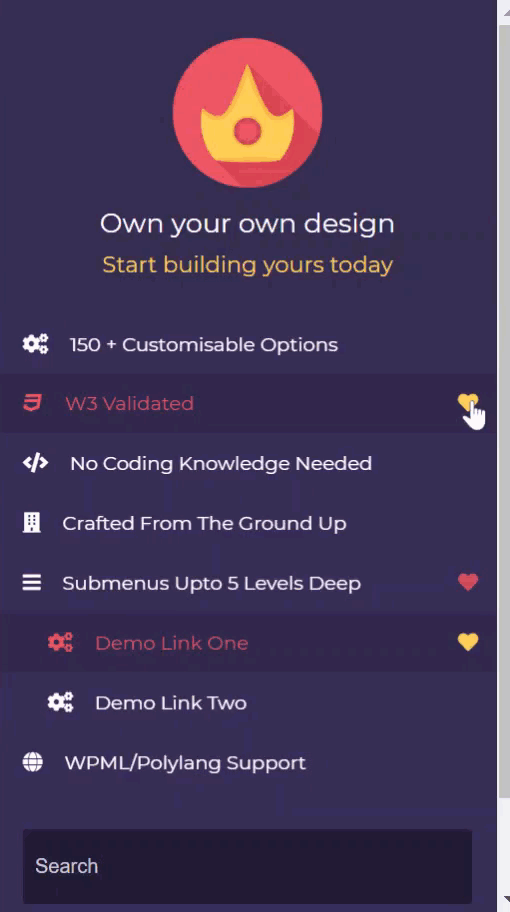
Responsive Menu Pro Plugin is one of the popular and best WordPress plugins for mobile menus. The plugin lets you convert your current theme menu into a mobile-ready, fully W3C compliant responsive design in seconds. It is a no-coding platform where without coding knowledge anyone can create device-friendly navigation menus. The plugin here will help you to create an accordion WordPress mobile menu. In just a few easy steps.�
- First, Purchase the pro plugin, once purchased your account will be created. Then log in, you will see purchase details including license key, invoices, and download link.�Click on the responsive-menu-pro.zip under the Products section. Then the zip file will be downloaded, extract to your desktop folder.��
- Install the plugin in WordPress, for that login to your WordPress. Navigate to the left sidebar in the dashboard to the Plugins option and click Add New. Navigate to Upload Plugin and select the zip file (if you have not extracted it before) then click on Install Now. It should then install all the relevant files of the plugin successfully.�
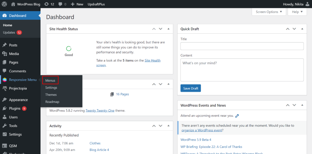
- Now, to Add Accordion you�ll first have to select a menu (if you have created the menus before). Navigate to Responsive Menu > Menus, select from the menus and click on Customize button. A responsive menu window will get open, then go to Menu Styling.�
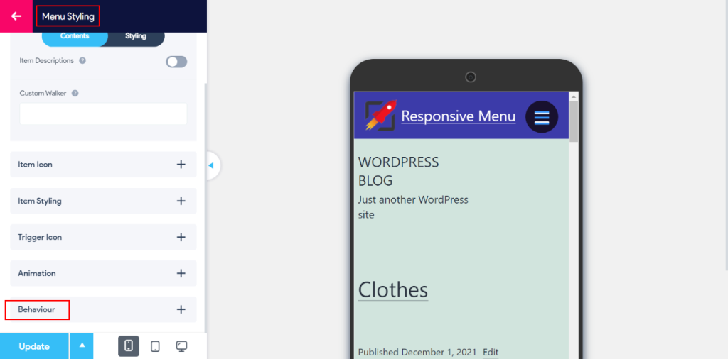
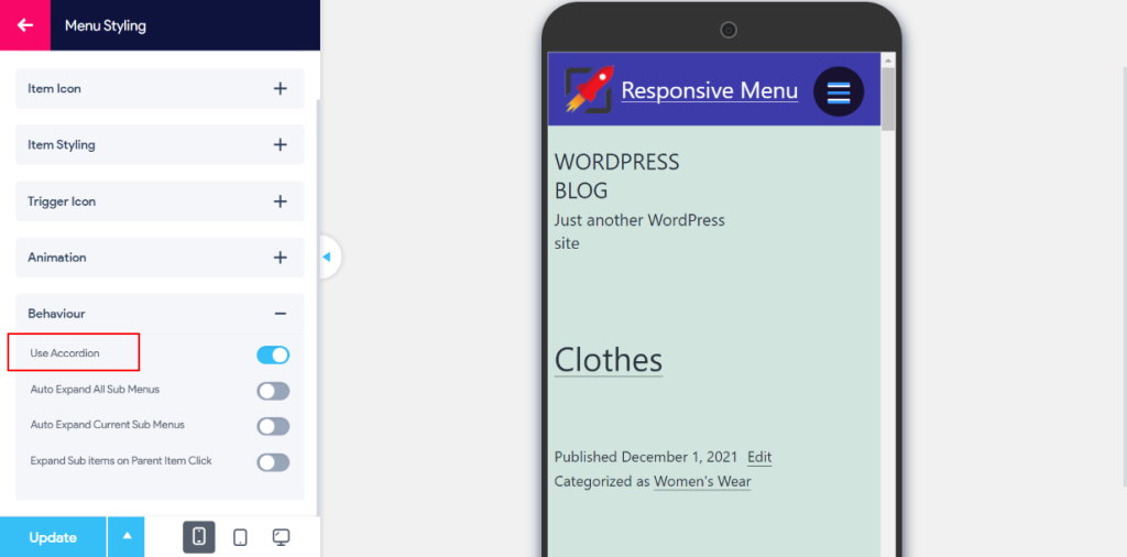
- Then click on the Behaviour section, you�ll see the Use Accordion option. Enable the option and click on the Update button. Your changes will be saved.�
- If you don�t have pre-made menus, create New Menu by navigating to Responsive Menu > Menus and clicking on the Create New Menu button. �Select Theme and Menu Settings and save. Your menu is created.�
- Then to create different menu items and sub-items, go to pages, add new pages for each category. Once done, go to Appearances > Menu there select your created menu to edit. Under Add Menu Items, select all the items you need from pages, posts, and categories sections.�
To add sub-categories/sub-menus under categories you can do it in the �Menu Structure.� Drag the menu you want as sub-categories to the right side.� It will be referred to as a sub-item of the corresponding menu.�
(Note: To know more in detail how to add categories and create a menu read An Easy Guide to Mega Menu Navigation article.)�
Other Plugins�
There are other plugins through which you can create a good accordion mobile menu. Otherwise, you can also create accordions manually through codes. If you are not interested or don�t have knowledge of coding then plugins are of the utmost help. Below are the following WordPress plugins you can use for creating a WordPress accordion mobile menu.��
- Accordion
- Accordion FAQ
- Tabs – Responsive Tabs with Accordions
- Bellows Accordion Menu
- Easy Accordion
- Shortcodes Ultimate
Wrapping Up
This is the end of our article on �How to create WordPress accordion menu.� In this article, we talked about what an accordion menu WordPress is and how you can create it through the Responsive Menu Pro plugin.�
I hope you understood the 5 mins guide on the accordion menu and where you can use it. Using an accordion menu in WordPress can be helpful in a lot of ways, it depends on each website�s audience.�