Do you have too many categories and subcategories to navigate? If yes, then Mega Menu navigation is the one for you. There are different navigation menus and each plays a significant role, however, it is necessary to know what suits our website best. That means, which navigation menu can increase your SEO, boost sales and traffic.�
To make it simpler, in this article, I am going to specifically talk about Mega Menu and with the Responsive Menu Pro plugin how you can build WordPress Mega Menu.�
What is a Mega Menu?
The mega menu is a type of navigation menu that is a drop-down interface with multi-level expansion. It means it lets all the categories and subcategories be visible at once and is technically packed into a single menu. They are laid out either horizontally or vertically depending upon the website, sometimes it will be split into sections and sometimes not.�
Benefits of Mega Menu to websites
The advantages of mega menu navigation on e-commerce are:
- Mega Menus offers a better user experience. With good visibility and easy access, users don�t have to face any complexity and get to navigate to any page easily.
- It is well-organized and has easy to flow style
- Mega Menu lets you add images, icons, and other typography
- They are functional as well as stylish. That means you can now match your website theme with the navigation menu without comprising the responsive menu.
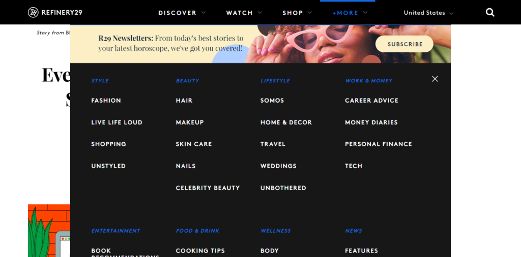
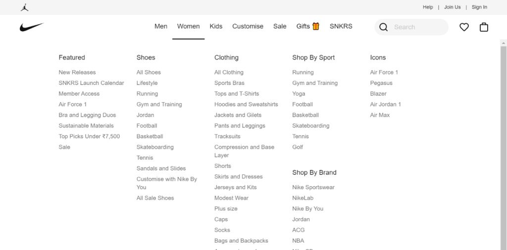
Mega Menu Examples
To make the idea of the mega menu more clear, below are a few pictures of websites that use mega menu navigation. Some famous websites that use this type of navigation are:
- Adidas
- Refinery29
- Estee Lauder
- Walmart
- Starbucks
- Puma
When to use the Mega Menu?
It is necessary to know when to use the mega menu navigation,� if used correctly it enhances the site and its SEO. However, vice versa it can also result in lower traffic, conversion, and overall SEO ranking which can ultimately lead to loss of your brand. Therefore, it is important to know when to use the mega menu navigation. Below are a few points that tell when mega-menu should be used
- When the style of the menu enhances the website
- When it can boost sales of the websites
- When navigation requires three levels of hierarchy.� In short, when you think there are too many categories and sub-categories.
- When users have high expectations.�It means visitors are accustomed to seeing mega menu navigation in retail websites or large department stores.�
- To avoid a longer drop-down menu
How does WordPress Menu Plugin help?
Now let�s talk about how you can create a mega menu for your website through WordPress Menu Plugin – Responsive Menu Pro. But first, let�s see what the Responsive Menu plugin is. It is a popular and best WordPress plugin that provides you with the option to create a stunning and device-friendly website navigation menu. It is a no-coding platform where coding knowledge is not required to create a mobile-friendly, W3C-compliant responsive design. It comes with 6 different themes which are fully device supported
Free Features in Responsive Menu Plugin
- Hamburger Icon (3 horizontal lines) or Display Icon text
- Change Toggle Button color log in
- Add custom HTML components and more
- Set font, font sizes, and background
- Limited choice of menu animation
Features that come under Responsive Menu Pro
- Desktop and Mega Menu
- 20+ Button Animations�
- 600+ Font icons from FontAwesome and GlyphIcon
- Touch Gestures and Keyboard Commands
- Header Bar
- WPML and Polylang support�
Now, let�s get into the tutorial:
1. Purchase the Pro Plugin
To start with, you�ll have to first purchase the pro plugin as the Mega Menu feature is available in the pro version only. Once that is done, your account will be created which you can access (login first). There you can see all the orders at the bottom and then click on View Details and Downloads.�
Further, you will see purchase details including license key, invoices, and download link. Click on the responsive-menu-pro.zip under the Products section.�
Then the zip file will be downloaded, extract to your desktop folder.�
2. Install the Plugin in WordPress
To install the responsive menu plugin in WordPress (similar process to any other plugins), log in to your WordPress. Navigate to the left sidebar in the dashboard to the Plugins option and click Add New.�
There navigate to Upload Plugin and select the zip file (if you have not extracted it before) then click on Install Now. It should then install all the relevant files of the plugin successfully.�
3. Create Menu
Now comes the important part of the process in which you have to create a menu. If you already have menus or want to add default menu items then go to Appearances > Menu. You will see the Menus page, there under the Edit Menus section, you can first customize your �Menu Name� under Menu Structure.�
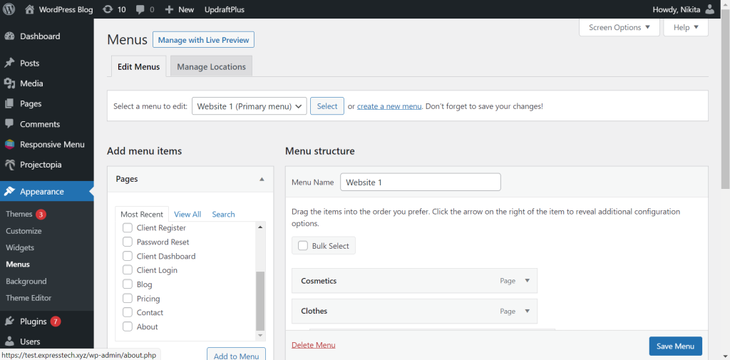
Further to add default pages to the navigation menu, on the left side you will see the Pages section under �Add Menu Items.� Select the pages from the option available and then click on Add to Menu button to add the list.�
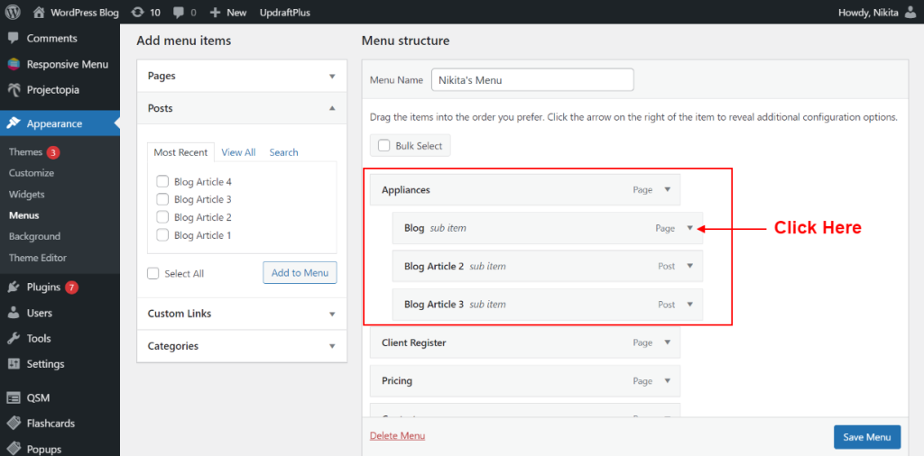
Now if you want to add sub-categories under categories, you can do it in the �Menu Structure.� Drag the menu you want as sub-categories to the right side.� It will be referred to as a sub-item of the corresponding menu. You can also operate it from the dropdown button �?� (as shown in the picture)
You can add posts for the blog page under the �Posts� section, if you also want to add custom links go to the �Custom Links� option.�
You can select Menu Settings and then click on the Save Menu button at the bottom to save and update the menu.��
4. Customize Mega Menu�
Now, if you want to add another category/page to the default �Menu Items�, then go to Responsive Menu > Menus. Then add New Page by navigating to Pages from the left sidebar. Customize the page name that you want in your navigation menu and publish it (as shown in the picture below). It will be then added to the �Menu Items� in the Appearances > Menus section.�
Further, you can also add Posts by following the same procedure as above. Instead of Pages, you have to create new �Posts� under the posts option at the left sidebar.�
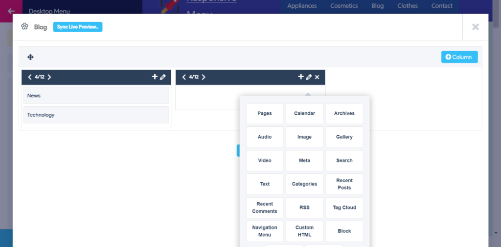
To build a mega menu set up, customize it and even add sub-menus, click on the �Customize� button beside your new menu in the Responsive Menu plugin – Menus. Then, the Responsive Menu window will open up, select Desktop Menu > Mega Menu setup. Enable all the menus to be displayed on the navigation menu.�
Click on the settings symbol beside the menus and customize each menu by adding columns (12 limited) and unlimited rows. Further, you can also include pages, calendars, links, images, and much more (as shown in the picture below).�
5. Update and Done
Once you�ve added sub menus and customized them, click on the Update button at the bottom. Your changes will be saved and� Mega Menu navigation will be created.
Conclusion
So, this was it for the topic �When to use a Mega Menu for Navigation?� The mega menu is simple to understand and more simple to create through the Responsive Menu Pro Plugin. Through the plugin, a mega menu not only becomes compatible with desktops but also with other smaller size devices.�
You can also create other navigation menus like hamburgers and standard desktop menu through the WordPress menu plugin. It is important to choose the navigation menu that works best for your website�s items.�
However, you�ll have to purchase the Responsive Menu Pro plugin to create all three navigation menus. Responsive Menu also has a 14-Day refund policy, if you’re unhappy with the plugin’s working, you can claim a full refund. Try Responsive Menu.