Tired of looking for a free responsive menu for your WordPress website? Well, you have stopped at the right place! Responsive Menu is a free WordPress plugin that allows you to create versatile and beautiful website menus.�
In this plugin you not only get a range of free and customizable themes but also you can create your own menus with the custom CSS feature. But wait, what is the buzz about the new 4.2.2 update for the Responsive Split Menu?�
Besides being an all-in-one Menu creating plugin, it also gives you complete access and control of the menu�s working and display. Let us see what you get in this new update for the Mobile Menus.
What is a WordPress Responsive Menu?
WordPress Menus are a collection of arranged lists that appear at the top of your website. The main section of your website is mostly represented in the menu. A lack of a menu may make your website less organized, which will create a negative impression among your clients and lower your website’s search engine ranking.
WordPress allows users to add menus and sub-menus to their websites. Menus can be used to include links to your most important pages, blogs, categories, pricing, contact information, and custom links like social media profiles.�
Visitors can easily navigate to their desired content and pages. As a result, any important information on your website has no fear of being overlooked. The function and design of the menu create a logical flow.�
Also read: 9 Best Menu Plugins for WordPress to Impress your Visitors
What�s New for Mobile Menus?
Mobile menus are a tough nut to crack when it comes to working with WordPress. Especially when you need to figure out the menu display columns. Earlier it was a social acceptance that WordPress menus could only be lined up in one stack for mobiles. This was because:
- There is a lack of screen space
- WordPress menus are not customizable
- Menu displays are generic
But these challenges are no more to be defeated. The Responsive Menu plugin caters to each of these problems with the solution of the Split Menus!
What are Split Menus?
Split menus are an innovative way to re-structure your menu display for mobile WordPress websites. Other than being able to restructure your menus, you can also save up your menu space for more features to fall in.�
Features of Split Menus:
- Customizable Menu Space: By re-structuring your menu space, you can add more tabs under your mobile menus. This would also mean you can add or subtract a number of columns and tabs.
- The Number of Column Spaces: Column spacing is the most crucial part of split menus. It allows you to add or subtract a number of generic columns on your Mobile and Desktop WordPress websites.
- Customizable Menu themes: When it comes to creating a Responsive Menu for your WordPress Website, it all ends with its compatibility with your website. Whether its functional or visual, the Responsive Menu plugin has a fully customizable interface and a range of themes to choose from.
How to Work with Split Menus in Responsive Menu Plugin?
�Let us see how to use the Split Menus for your WordPress website:
Step 1:� Install and Activate the Responsive Menu Plugin�
To begin, you must install and activate the Responsive Menu Plugin on your WordPress website in order to configure WordPress Menu. Make sure to install the plugin if you haven’t already!
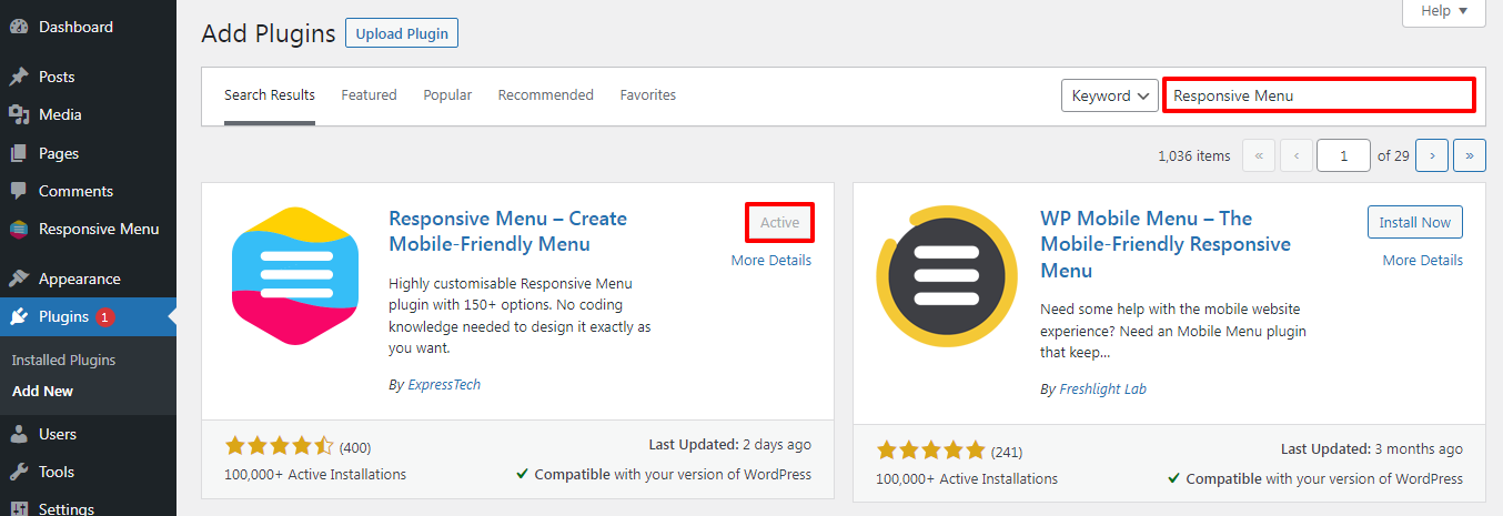
Get the Responsive Menu Plugin from the WordPress Repository or the official website, whichever is more convenient for you. You can even get the plugin from the website’s Dashboard.�
If you are a WordPress Beginner and are unsure how to install a WordPress Plugin, please read our article ‘How to Install New WordPress Plugin’.�
Activate the plugin after it has been installed.�
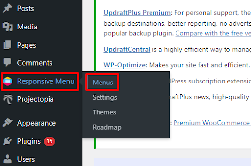
Step 2: Create a Menu
Go to Responsive Menu>>Menus option at the left sidebar of the page.�

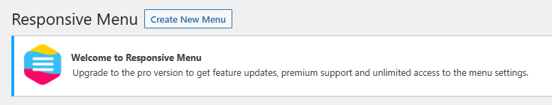
Click on Create New Menu button at the top of the page.�
There are four installed themes in the Responsive Menu plugin, choose them according to your preference. Select a theme that meets your website�s menu needs.�
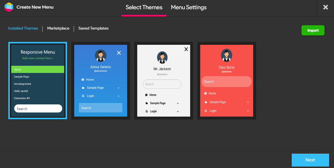
Select Installed Theme and then click on the Next button.
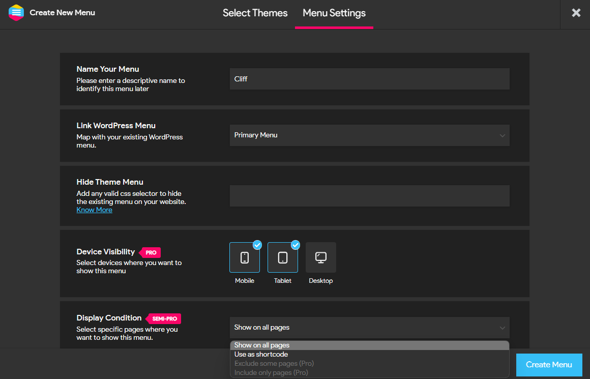
In the Menu Settings, Make sure to Name Your Menu.�
You can map your menu with the existing menu using the Link WordPress Menu Add any valid CSS selector to hide the existing menu using the Hide Theme Menu option.�
Responsive Menu WordPress plugin enables its users to show menus on mobile, tablet, and desktop using the Device Visibility option. Choose the Display Condition for your menu from four different options. Get Responsive Menu Pro to use this feature.
Finally, click on Create Menu button.
Step 3: Adding the Split Menus
Now comes the fun part. Once you are done editing your menu in various tabs, like styling and linking. Go on to Mobile Menu > Containers > Menu.�
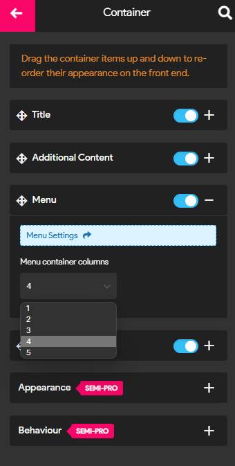
Here you can find the menu container columns which you can use to edit your menu space.�The menu space ranges from 1 to 5 which means you can toggle your menu up to 5 columns.�
As shown in the video below, you must update the menu settings to see the results. And your split menus are in function now!
Wrapping Up
We hope this article has made it easier for you to set up the WordPress menu. Make sure to read the entire article and choose the method that is most convenient for you.�
Furthermore, you don’t need to make a fuss when choosing a WordPress plugin because our research team chose this plugin based on its enhanced features, customization options, ratings, customer reviews, and much more.