Want to know how you can create a Hamburger Menu that is equally Beautiful & Responsive on your WordPress website? In this article, I have explained the steps for building a Hamburger Menu/Mobile Navigation Menu without writing a single line of code.
There are many benefits of using WordPress and one of them is the ability to add extra functionality to your site with the help of plugins. Plugins make it a lot easier to operate and manage a WordPress site and to make the website more engaging for your visitors.
One of the ways of attracting more visitors to your website is that by making the site more Beautiful, Accessible, Easy to Navigate, and Providing Quality Content. So, to make your website look elegant and appealing we will replace the traditional navigation menu with a mobile responsive hamburger menu.
Hamburger Menu or Mobile Navigation Menu is a navigation menu consisting of an icon with three horizontal bars that resemble a “Hamburger”. It gives your website a minimalist look and a clutter-free experience.
Hamburger Menu is widely used in modern websites and is considered be a space-saver as it hides the menus and sub-menus and makes it appear only when the Hamburger Menu button is toggled by the user, thus letting users focus more on the website content and be less distracted owing to less space.
To build our own Hamburger Menu we will be using the Responsive Menu WordPress plugin. Responsive Menu is a popular, free, and easy-to-use WordPress Menu Plugin that allows you to convert your current theme’s menu into a mobile-ready, W3C compliant responsive menu within a few seconds.
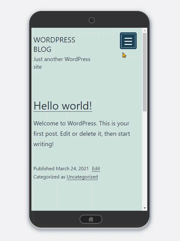
Below is a slight comparison of what really the Free Responsive Menu Plugin can do to your WordPress Menu.
(Before)
(After)
Are you Excited? Let’s now build your own Responsive Menu by following the steps mentioned below.
Steps to create a Hamburger Menu on WordPress website
Step 1: Installing the Responsive Menu Plugin
To install the responsive menu from your WordPress Admin panel navigate to Plugins > Add New > Search for”Responsive Menu” in the plugins search and hit enter.
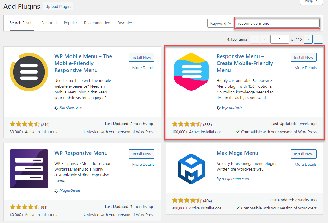
Install and Activate the Responsive Menu plugin.
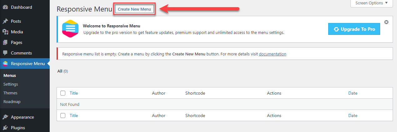
Step 2: Creating a New Menu
Now, you need to create a new Responsive Menu. Navigate to Responsive Menu and hit the Create New Menu Button.
Now choose any of the installed themes from the Installed Themes Section or Purchase Premium Themes from Marketplace.
If you choose to purchase a new Responsive Menu theme then you will be taken to the purchase page of the respective theme where you can download the zip file and later upload it to the Responsive Menu.
For the sake of this demonstration, we are going with the default free theme and setting up the Responsive Menu.
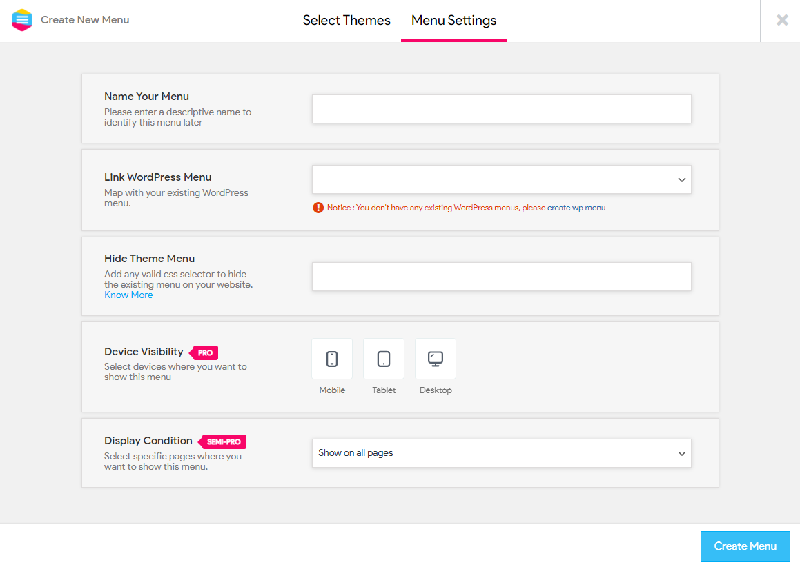
In Menu Settings, you need to configure some initial settings to create a new menu.
- Name Your Menu – Here you need to enter the name of your menu just for identification purposes, it won’t be displayed on the front-end to the user.
- Link WordPress Menu – If you have an Existing WordPress menu then the menu will be shown in the drop-down just select the menu name from the drop-down. If you have a new WordPress installation and don’t have a menu then you need to create one by navigating to Appearance > Menus from the WordPress dashboard.
- Hide Theme Menu – Using this option you can hide your Original Theme Menu that came with your current theme. So, for replacing the old theme’s menu with the new Responsive Menu you need to enter the existing menus, CSS selector. Know more about Hiding Original WordPress Menu.
- Device Visibility – Here you can choose on what devices the Responsive Menu will be shown. You can choose between options like Mobile, Tablet, and Desktop devices. Unfortunately, this feature is only available for Pro Plan users.
- Display Condition – This option allows you to display the new Responsive Menu on certain instances like Including the menu only on some pages, Excluding some pages, Use it as a shortcode or show the menu on all pages of your website.
Also Read: Best Online Exam WordPress Plugin of 2021 [Free]
Once you filled in all the required details hit the Create Menu button and the menu will be created. After successful Menu Creation, you will be taken to the Menu Customization window where you can see all the configuration options including Configuring Menu Container, Toggle Button Configuration, Menu Styling, Themes, Menu Settings, and more.
Step 3: Mobile Menu Customization
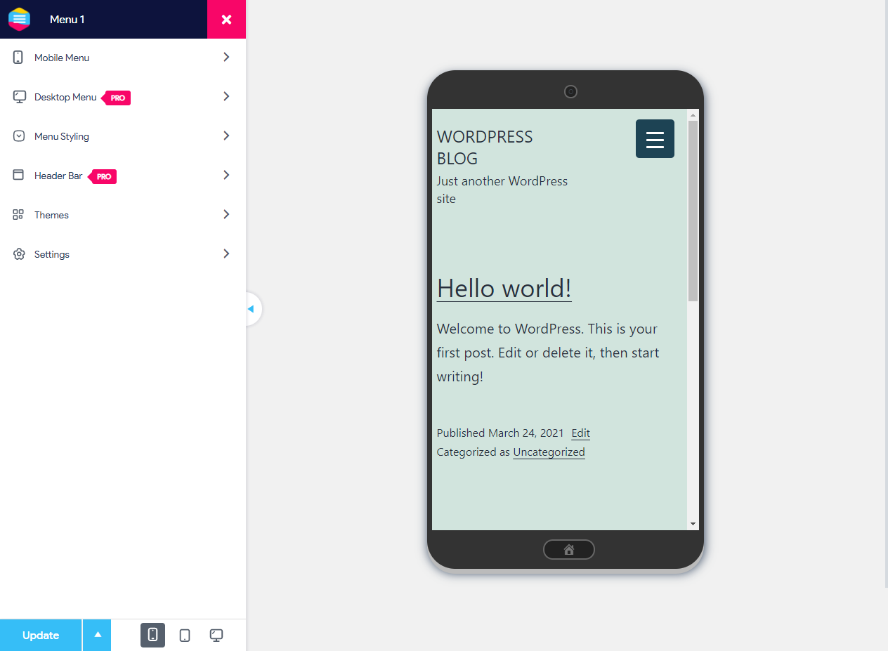
As you can see the default Responsive Menu theme is working quite good but anyways we can customize the menu much more and style it as needed.
Configuring Menu Container
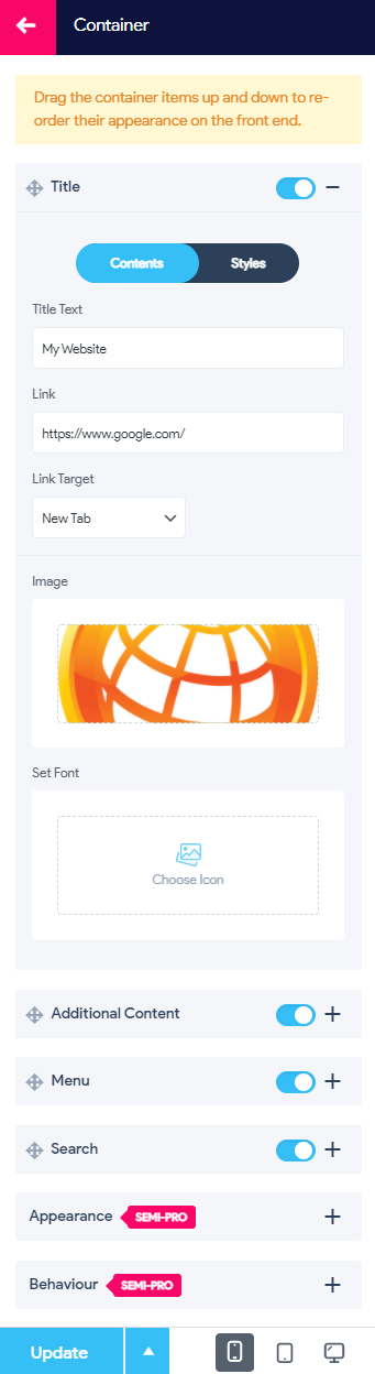
From Menu Customization Window Navigate to Mobile Menu > Container
Configuring the Title
Here you can Add The Container Title Text and Change it from the Responsive Menu to any other Text you want. Also, you can link the Title Text to a page or post and also set the link to open on the same page or a new tab. You can even display a logo image or set a font icon above the Title text.
Using the Styles Menu you can style the Title Text with Padding, Background Color, Background Hover Color, Font Size, Text Alignment, Font Weight, Font Family, Image Width, & Image Height.
Configuring the Title
Add any additional content supporting the title inside your menu container and style it with Padding, Font Size, Text Alignment, and Text Color.
Adding Padding to the Menu
In the Menu, you will a single option to add padding to the whole set of menus in the container
Also Read: 9 Great WordPress Mega Menu Plugins for Better Site Navigation
Configuring the Search Box
Being a free user you have a limited configuration option and you can only style the search bar using padding, height, border radius, Text Color, Background Color, Placeholder Color, and Border Color.
Container Appearance
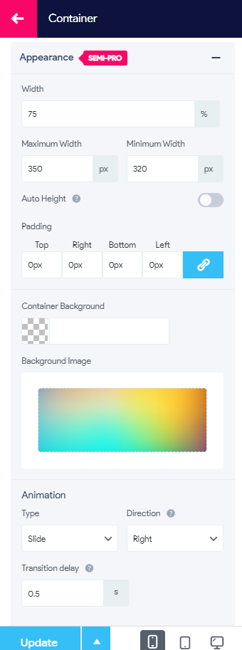
Container Appearance is a Semi-Pro feature using which you can edit the Width, Maximum Width, Minimum Width & Padding of the menu container.
You can even change the Container background color or add a background image. In the animation section, you can choose between three container animation effects, and set the direction from where you want the container to appear.
By default, the Container is configured to appear from the left but using the option you can change the container to appear from the right. You can even control the speed of the animation with the transition delay option.
Container Behavior
Container Behavior is a semi-pro feature it consists of options like Hiding Menu on Page Clicks, Link Clicks, and other pro features. If required you can enable these options.
Next is the Toggle Button Configuration,.
Configuring Toggle Button
Using the Toggle Button the Responsive Menu is activated and the Container Shows up. The Toggle Button is extremely customizable and includes Configuration options like Button Style, Button Position, Button Type, Button Text, and Button Behaviour.
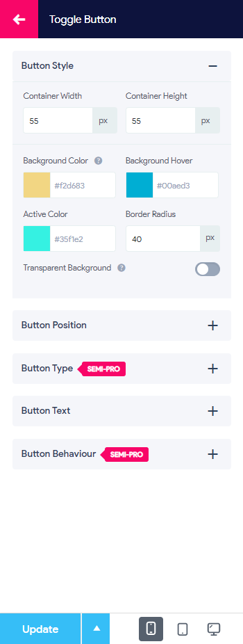
Button Style
Using this option you can configure things like Container Width, Container Height, Button Background Color, Button Hover Color, Button Active Color, and Button Border Radius (You can make the button appear more circular by increasing the border radius). You can make the button background transparent using the Transparent Background toggle button.
Button Position
Using this option you can alter the button position and make the Toggle Button appear on the right/left as required, set the button position/how you want the button to stick to its place. Also, you can set the button distance from the side/from the top.
Button Type
Using the Button type option you can change the hamburger lines to an icon or a custom image. Animate the hamburger lines using the button animation. Adjust Line Spacing, Line Width, Line Height, Line Color, Line Hover Color, and Line Active Color.
You can even have a text displayed on the button and do a lot more things using Button Text and Button Behaviour options respectively.
Step 4: Mobile Menu Styling
Likewise, you can customize the menu much more using the Menu Styling option that can be used to add individual menu item icons, style menu items using Typography, Text Color, Background Color, Border Color, etc.
This is all you need to create a Hamburger Menu on your WordPress website using the latest Responsive Menu Plugin.
Why go Pro with Responsive Menu Plugin?
To fully customize your WordPress menu using 20+ Button Animations, Desktop and Mega Menu Implementation, 600+ font icons from FontAwesome and GlyphIcon, Control Menu using Touch Gestures and Keyboard Shortcuts, Setup a Multilingual Site and do a lot more things you have the option to upgrade to the Responsive Menu Pro Version.
Responsive Menu Pro unlocks scores of new features that otherwise remain hidden in the free version. You can creatively build an awesome menu and take inspiration from websites that use Responsive Menu Pro as their preferred menu plugin on their website.
Conclusion
The hamburger menu is the best option if your website is viewed by users on varied devices. With the Responsive Menu plugin, you can have the menu displayed beautifully to all of your users.
This is how you build a Mobile Responsive Menu/ Hamburger Menu on your WordPress website without writing any code with the help of the Free Responsive Menu Plugin for WordPress.
To know more about this amazing plugin and its features visit
Liked this article? Here’s another article about 7 Essential WordPress Plugins that your website must have in 2021.