The mobile navigation menu is an important element in web design! Whether you want to increase your SEO rank, traffic, or overall conversion, device-friendly responsive menus are indeed pivotal. It is also necessary to design a responsive menu that syncs with your website�s theme and is approachable for menu items. What if I say that you really don�t have to create themes for a device-friendly navigation menu? Because that is what this topic will tell you! �All you need to know about Responsive Menu Theme.��
In this article, I am going to talk about the Responsive Menu plugin�s themes. These RM theme collections are stunning and customizable that can be used as templates, it makes work simpler.�
About Responsive Menu�
Responsive Menu Plugin is a WordPress plugin for responsive mobile and desktop menus. It doesn�t ask for coding knowledge, and also allows you to convert the current theme menu into a mobile-friendly one. It comes with a W3C Compliance Responsive design, you can also customize the menu as per the theme.�
With Responsive Menu Pro, you get features like Desktop and Mega Menu, Touch gestures and keyboard commands, 600+ font icons, access to 20+ button animations, and much more. It comes with pre-built themes that make it easy for users to modify their navigation menu. Besides, you can edit the particular template as per your requirements. Responsive menu themes work just the same and best on all devices.�
Responsive Menu Themes
Responsive Menu plugin themes are carefully designed and developed by the best and experienced software developers, to help you use themes easily without much effort. There are a few premium pre-built themes that are not compatible with the free version of the plugin due to its limitations. All of the following menu themes are worth using however, you�ll have to be careful, choosing the one that fits your installation.
Now let�s know all about different responsive menu themes collections.�
1. Glance RM Theme
Glance RM Theme is a sidelong style theme that shows the navigation menu diagonally with displayed items and subitems. Though it is aesthetically pleasing with a smooth glance animation effect it gives when the menu is toggled. But it is not a preferred choice when a website has many (more than 7-8) menu categories and subcategories to be navigated to.
Due to its skewed structure, visitors may face trouble navigating the contents and the whole content won�t be viewed properly. However, it is best and recommended for menus with fewer items and subitems as it just gives a light and classy look to the responsive menu.
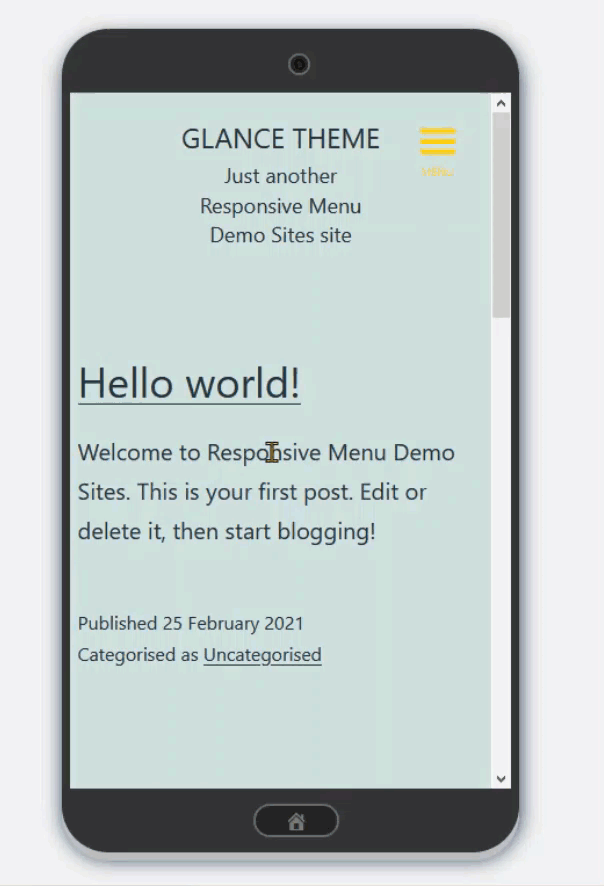
By default, this theme comes with a purple and white sliding background which you can change as per your website theme under the Glance RM Theme settings. The best part about using Responsive menu themes is that the effect remains the same in every device. �You can also further customize the menu style, content under its theme settings.
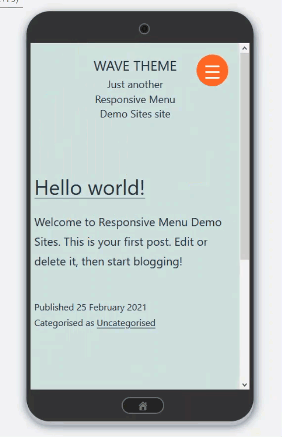
2. Wave RM Theme�
Another theme in the RM theme collection is Wave RM Theme! As the name give away, this menu theme produces a wave/ripple effect when users click on the menu toggle button. It gives you a bold appeal with orange-white default color settings, however, you can change the same under the settings.
You can also animate the menus and sub-menus using theme settings. Cool, isn�t it? The theme comes with only a single theme setting, besides you can customize the toggle button by changing Button Style and sync it with your website�s color scheme. Along with this, you can change menu item styling, appearance, add additional content, and some more.�
3. Oshine RM Theme
Unlike the above themes, Oshine RM Theme is more subtle and simple in look. It has a unique layered stack effect, which means push-type animation. As usual, it comes into effect when users toggled the menu button. Just like the other two themes, it comes with its default Green color background. Which of course, you can change based on your website theme under the Stack color in Oshine RM Theme settings.
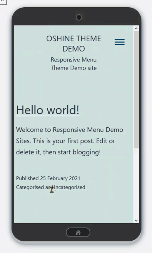
The plugin has come up with two new theme options that can be used to modify Oshine theme settings. In the settings, you can also change the menu display slide and add additional content with the container option,� more settings will be added in the future. Until then, enjoy the already present settings.�
4. Electric Blue
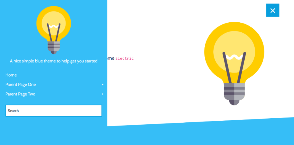
This responsive menu theme is compatible with both the free and pro version of the plugin. Electric Blue as the name suggests is all about giving a simple nice blue theme to the navigation menu. It combines the cool color scheme with image, centered title, and subtle hovering. To make the idea of the Electric Blue theme more clear, you can see its live demo so that you�ll know how responsive menu will look using this theme.
5. Simply Red
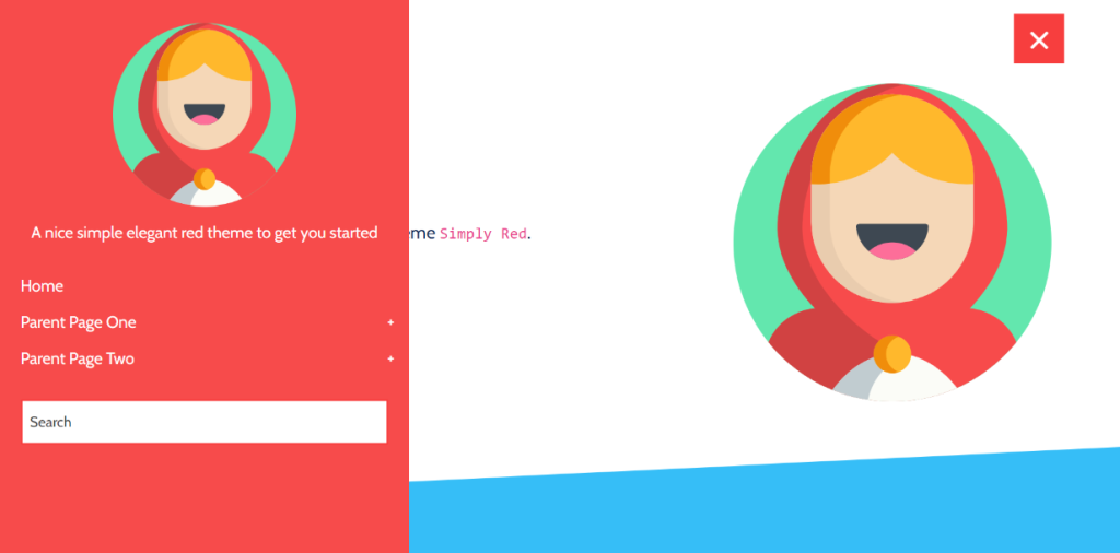
This theme is just similar to Electric Blue in a way that both are of push-type animation. However, it’s unlike in a way that it gives a bold color theme to the responsive menu, as the name depicts. If your website is of a red theme or contrasting to the color, you can surely go for this theme.�
6. Full Width
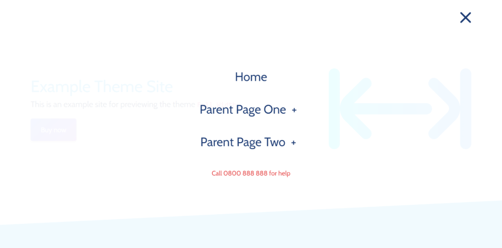
The Full-Width RM Theme is different from all the other responsive menu themes mentioned. It is contrasting in a way that it provides a classy menu that when the menu toggled button is clicked it opens and covers up the whole screen. The home screen gets fade away in the background and the menu takes the full-width space. With large, centered menu items and color variations across menus and sub-menus, it is one stunning way to present a navigation menu.�
Finishing Words
These were the RM Theme collection that you should know about. When it comes to responsive menu themes, it is always crucial to look out for the best for your website, that resembles your website. These were just a few amazing pre-built themes that you can save and use multiple times. However, that doesn�t mean you must use any of these, in the responsive menu plugin you can make your own template.�
If you�re facing the mobile navigation menu problem then the Responsive Menu plugin is your solution. Try the Responsive Menu demo and experience its greatness.