Home
Features
Themes
Pricing
Knowledgebase
0
Login
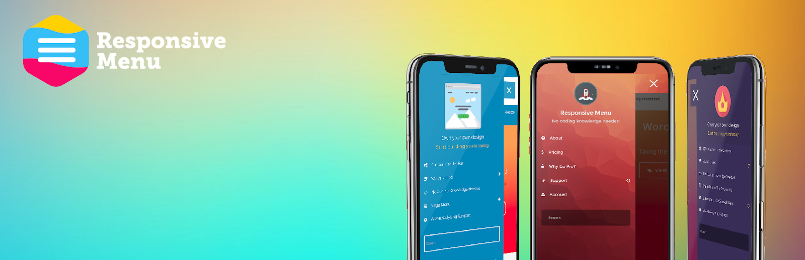
Enhance-Navigation-on-Mobile-Websites
14th July 2022
By
Vikas (admin)