Want to create an awesome-looking WordPress Hamburger Menu for Desktop? Hamburger Navigation Menu is a compact navigation style with three horizontal lines that you see on most Professional looking websites.
Most websites nowadays have a Hamburger Menu set-up. It not only looks cool and modern but makes the website look clean, and professional, eases navigation within the site, and lets you stuff more menus inside it giving a minimalist look.
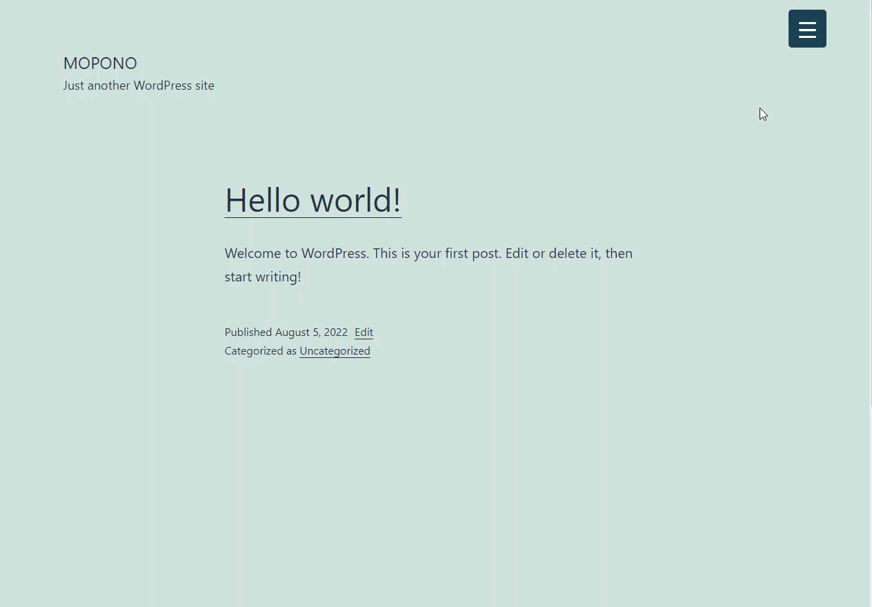
With the WordPress Hamburger Menu in place, the user won�t struggle to navigate to the desired menu. The WordPress Hamburger Menu is mostly positioned on the Top-Left or Top-Right of the screen.
Also, check the Comparison of Responsive Mobile Menus for WordPress.
Why use a WordPress Hamburger Menu in 2022?
Thanks to Norm Cox the inventor of the Hamburger Icon it�s now become a go-to solution for navigation on web and mobile applications.
Let�s admit it! WordPress Hamburger Menu is a Space Saver. It�s a button menu in websites, that once clicked opens up a Slide Menu or a Navigation Drawer with fancy and mesmerizing animations.
As of today, we need our WordPress websites to look less congestive and user-friendly, which is possible with Hamburger Menu whereas the traditional navigation menu bar takes an ample amount of space which thereby could�ve been utilized for other things.
Creating a WordPress Hamburger Menu for Desktop
To create a WordPress Hamburger Menu we are going to make use of a WordPress plugin called Responsive Menu.
It is the most downloaded Hamburger Menu Plugin on WordPress.org. No coding knowledge is required to set up this plugin.
Responsive Menu is a highly customizable WordPress Hamburger Menu Plugin that is responsive i.e. works across devices with varied screen sizes and is easy to use.
With Responsive Menu Pro, you can not only customize the Desktop Menu but the Mobile Menu too. You get the Mega Menu functionality and much more than that with this plugin.
Step 1: Download the Responsive Menu Plugin
To get the Hamburger Menu Functionality working on Mobile and Desktop devices you need to download the Responsive Menu Plugin and install it on your WordPress website. And, Activate It.
Step 2: Initial Setup
After installing the plugin you will notice a new Responsive Menu�Menu in the admin sidebar. Click on it, and head on to create a new menu.
At first, you will be asked to choose a theme/template you can go with the default Green theme or purchase any of the premium themes that come pre-configured with mesmerizing customized menus and premium animations.
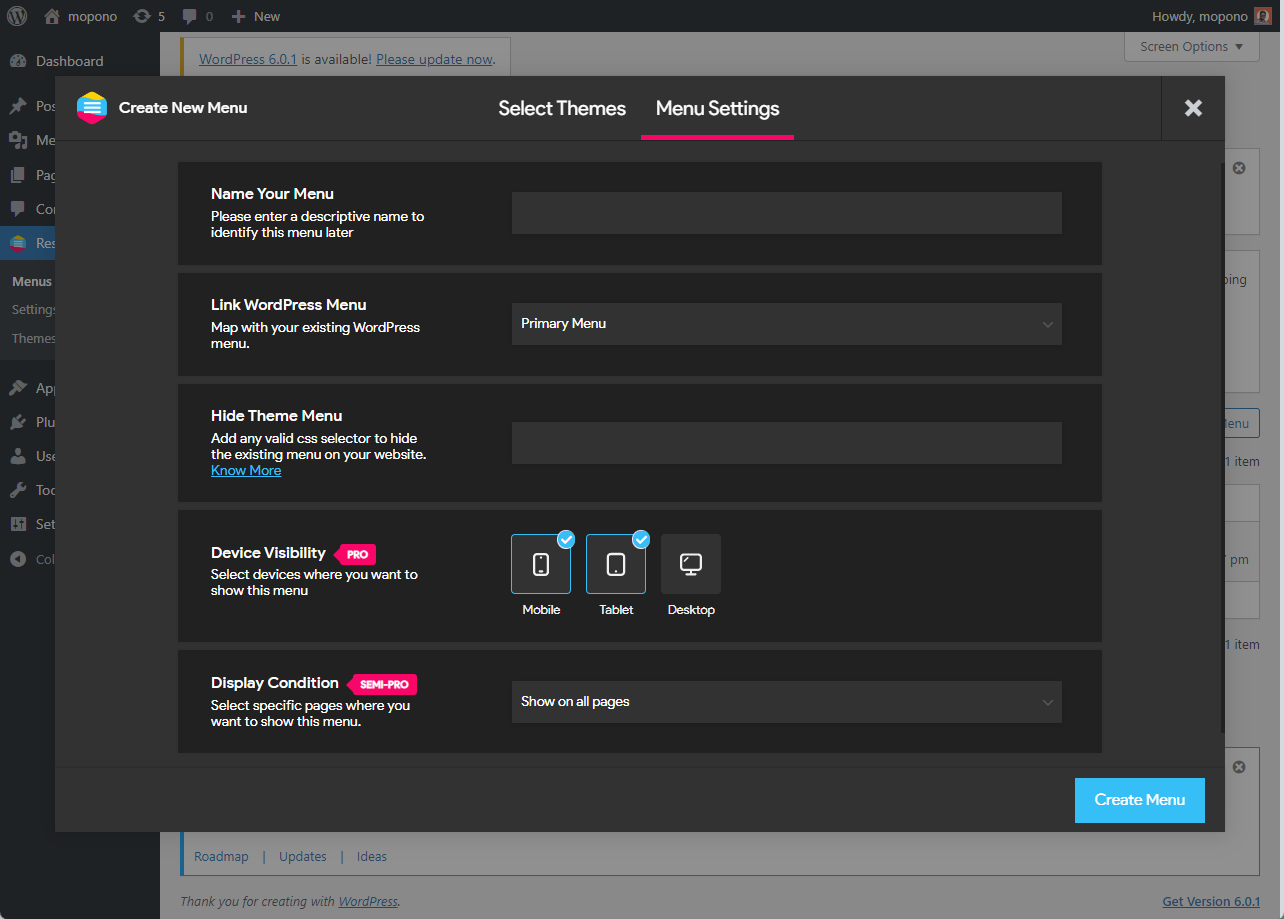
Click Next and you are into the Menu Setting. Here you need to configure 5 menu settings:
- Menu Name – Give a name to your menu
- Link WordPress Menu – Map your existing menu
- Hide Theme Menu – Enter the CSS selector to hide the original theme menu. You can skip this step and can configure this later in. But here’s the process to find the menu selector.
- Device Visibility – Select the devices on which you want to display the menu, even this can be configured later.
- Display Condition – Select the pages you want to display the responsive menu.
Step 3: Desktop Hamburger Menu Customization
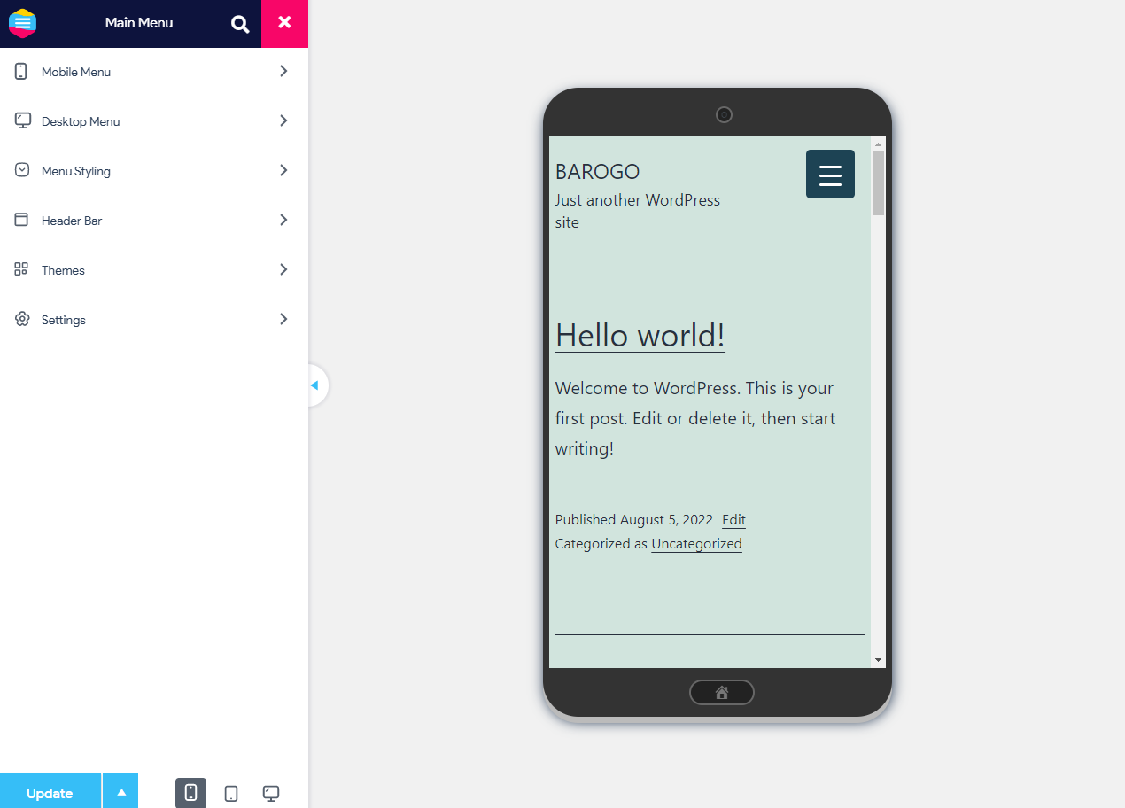
If all goes well, this is what you will see. A preview of the new menu on the right and menu customization options on the left. The Hamburger menu gets created for all devices including mobile, tablets, and desktops.�
You can use the device preview button beside the update button to switch between devices.
If you see your original menu under the new Responsive Menu then you haven’t hidden the original menu properly, please revisit point 3 of step 2.
Next, you can beautify the menu container and toggle button by going to Mobile Menu > Container & Toggle Button
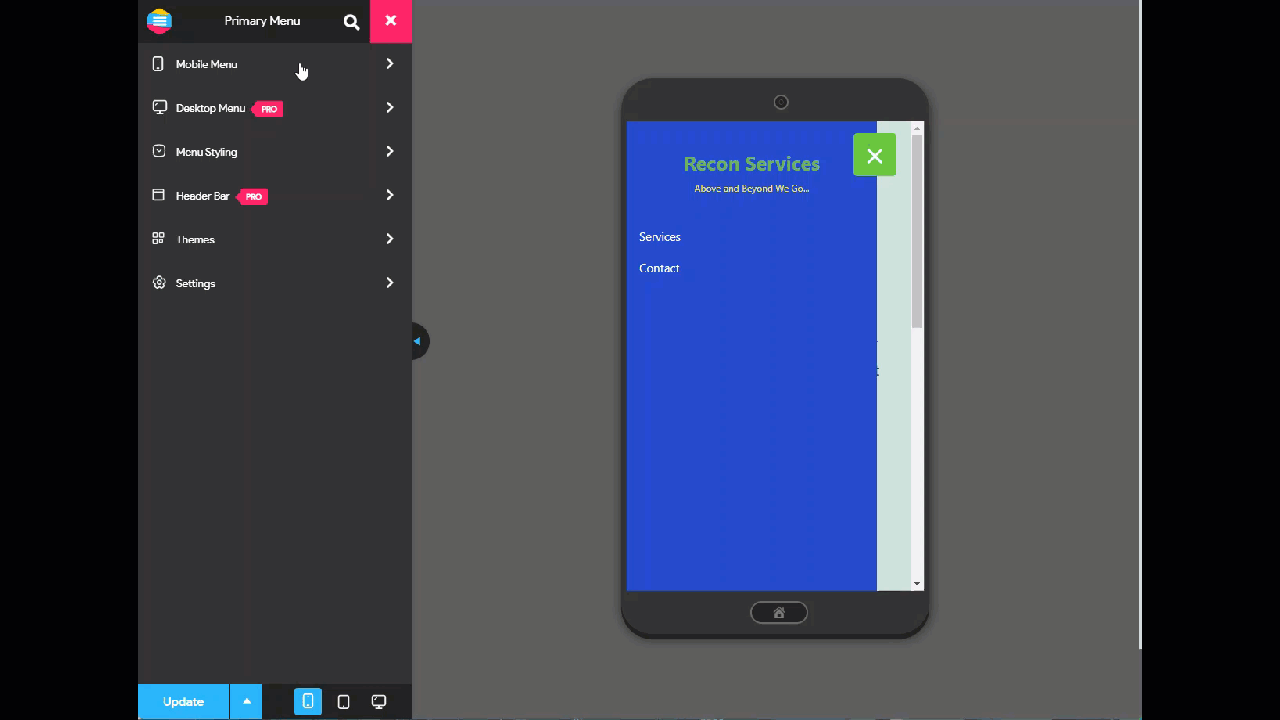
You can customize things like the Menu Title, Add/remove additional content, change container background, add an image in the container, change animation type, increase/decrease transition speed, and much much more.
Final Thoughts
Implementing these steps would surely make the website navigation easy to use and also help you save some frustrated customers.
Responsive Menu Pro not only allows you to create a Desktop/Mega Menu but also lets you display a header bar that is fixed. Let your users control the Menu using Touch Gestures or Keyboard shortcuts, and get access to 20+ Button animations and 600+ Font Icons from leading providers.
Tell us what you think about the WordPress hamburger Menu in the comment box below, Thanks!