
Hiding Original WordPress Menu
Hiding the original WordPress menu and replacing it with the new Responsive Hamburger Menu is quite simple.
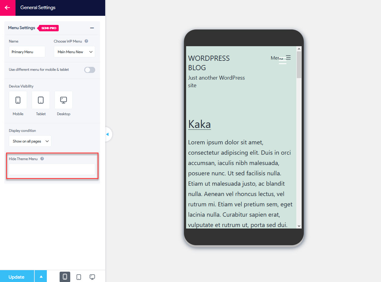
From your Responsive Menu Plugin navigate to the Settings > General Settings. Here you will see the Hide Theme Menu Option.
With this option, you can hide your current theme menu. To hide your current theme menu you need to put the CSS selector here. Any legal CSS selection criteria are valid.
By default, the original WordPress menu is displayed alongside the new Responsive Hamburger Menu (and sometimes even gets overlapped) if the original WordPress menu is not hidden.
So, Here you will need to manually hide the menu by entering the CSS Selector. You can find the original Menu Selector by right-clicking on the original menu > Inspect Element. Now click on the original menu to hide and copy the adjacent id or class selector.
For Example: class=" mobile -nav-toggle" or id="primary-mobile-menu" and paste it in the Hide Theme Menu Field with a prefix# for id or a . for a class selector.
For Example: If the selector is id="primary-mobile-menu" then you would enter #primary-mobile-menu in the Hide Theme Menu field.
You can hide multiple menus and even the original header each selector separated by a comma with the same method to understand better watch this video.
Note: While entering the class as your preferred selector to hide make sure that it is unique and not commonly used by other elements too. If it is common then it may also hide other elements using it.