Have you ever had a hard time navigating anything on a website through mobile or tablet devices? Have you been irritated just because it took a lot for you to navigate to a certain page but when you thought you were finally there, you weren�t. Because you had accidentally clicked on another category or link. Argh! And there went your another few minutes.�
The reason for the above scenarios is because the responsive menu was not mobile or other (than desktop) device-friendly. However, don�t stress out much, because in this article we have brought you the solution for the above issues.�
We will tell you about two WordPress menu plugins that have made so many lives simpler and easier and have been profitable for websites. You�ll see the feature and functional differences between Responsive Menu vs Quad Menu plugins.
What is a mobile navigation menu?
A navigation menu in a website is the most significant element in web design. In a website, the navigation menu is a list of links to internal pages, which appears commonly in page headers or sidebars. It allows the visitors to quickly access any pages/sections of the website.�
The mobile navigation menu is the important bridge and platform for human-computer interaction. It aims at guiding users in the right direction without letting them get lost and leave the website. A good responsive menu not only enhances user experience but also increases the SEO of the website and Conversion rate.�
Types of Menu (based on the plugins)
1. Mega Menu�

The Mega menu is the perfect solution for websites that have too much content with categories and sub-categories, commonly applicable for e-commerce websites. It is a drop-down interface with multi-level expansion, it lets you accommodate a website’s entire navigation into one menu.�
The mega menu as the name suggests is mega (huge), where sub-categories are listed within categories under the main panel. It has its own pros and cons, for simple with not many categories/lists it�s better to opt for a simpler and less overwhelming navigation menu. However, in another aspect where your website has too many pages to visit, this is the best go-to option. It can risk overwhelming visitors, but it can also help increase conversions.��
2. Hamburger Menu

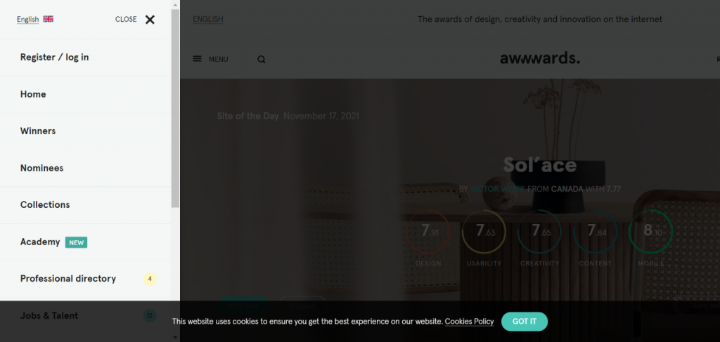
The hamburger menu or icon is the button in the website at the corner that opens up the list into a side menu or navigation drawer.� It was created by Norm Cox in 1981 for Xerox to indicate the list within the Xerox system. Nowadays, the hamburger icon is the compact and perfect solution for mobile responsive websites, unlike desktop menus, it hides the list until clicked.�
3. Desktop Menu/Standard Horizontal Menu

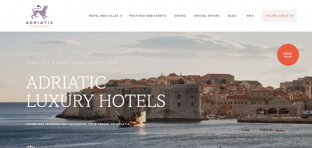
This type of menu is a common and standardized navigation menu style. The navigation design in this type is a horizontal list of the main site pages, which can be created either through graphics or HTML text.�
Responsive Menu vs Quad Menu Plugin
In this article, we are going to talk about two WordPress navigation menu specialized plugins – responsive menu vs quad menu. Both plugins have various features to help you build a beautiful and mobile-friendly responsive navigation menu.�
So, let�s get to know together all about the responsive menu vs quad menu plugins.
1. Responsive Menu Plugin

Responsive Menu plugin is one of the popular and #1 WordPress plugin that allows you to convert the current theme menu into a mobile-friendly menu. It makes sure that the navigation menu is responsive on every device and it looks natural no matter which device you are using.�
With over 2 million+ downloads and no coding knowledge needed, the Responsive Menu Pro plugin has to offer you 200+ customizable options with Mega menu support. It provides an easy-to-use admin interface, from colors, animation types to touch gestures, keyboard shortcuts, and much more.�
Main Features:�
- Desktop and Mega menu
- Header Bar
- Custom CSS
- W3C Compliance
- 600+ Font icons from FontAwesome and GlyphIcon
- Provides 20+ Button Animations
- Multi-lingual site ready with WPML and Polylang support
- Accessibility driven
You can customize the plugin to make the menu look aesthetic and accessible for visitors on Mobile, Desktop, Tablet/Ipad devices. You can also easily search or visit any page on the website by navigating to the hamburger menu.�
The Responsive Menu plugin fully adheres to its promise of delivering high code quality and follows W3C compliant design. You can also try its live demo to get a more clear idea, the plugin also offers a 14 day refund if you are unhappy with its working. You can also try its live demo to get a more clear idea.�
2. Quad Menu Plugin

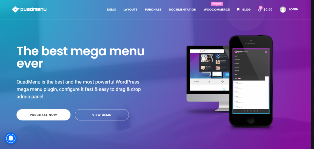
Quad Menu is another popular WordPress menu plugin for creating responsive mobile menus. They promise to be the most powerful WordPress mega menu plugin and offer you to create the best mega menus. It allows you to easily integrate the menu into the theme�s project.�
Not only that, but with Quad Menu you can also create carrousel and tab menus in a simple and native interface. The mega menu plugin also gives you the feature of Desktop layouts that grant you the ability to create vertical as well as horizontal mega menus both with the support for touchscreens.�
Main Features:
- Desktop layouts
- Touch interface�
- Drag & drop�
- Font icons and Google fonts
- Native widgets
Developer Features that include the following:
- Hook CSS Animations
- Change LESS Files
- Menu stylesheets developed with LESS
Quad Menu Plugin has different pricing features from free to developer. You can also see its demo to know more about the plugin.�
Wrapping Up
Hoping that you�ve got a clear idea of both the WordPress navigation menu plugins. Both Responsive menus vs Quad menu plugins are useful, have amazing features to work on, and can definitely help you with creating different responsive mobile menus.�
Now, it�s up to you to choose the one from both the plugins that work best for you.