Having a website with a Responsive Menu is the need of the hour. Given the number of active devices in the market, it becomes extremely important to make every aspect of your website responsive if you are still running on an unresponsive web design.
Your website should be able to handle all devices smoothly meaning, be it a Mobile, a Tablet, or a Desktop Device the website should mold its contents in such a way that the content is easily presentable by structuring itself according to the screen size of the device it is viewed in.
When it comes to responsive design, navigation is often a place where the issues can first be seen. All too often, responsive navigation menus appear cluttered, under-information, and inconsistent on different devices.
Top Navigation Menu or Navigation bar plays an important role in user interaction. A navigation bar is a horizontal navigation menu that allows people to quickly navigate a website. Having Good navigation helps users reach their goals faster, which increases the chances that they will return.
You’ll find navigation bars somewhere on almost every successful website these days. A navigation bar is nothing more than a table with links to the most important pages and categories of your website. In some cases these links are unique and in other cases are just duplicate links to the same page but from another category.
In this article, I have discussed how you can create a Responsive Menu with Submenu by using the Responsive Menu Plugin step-by-step.
Guide for creating a Responsive Menu with Submenus:
#1 Create a new menu
#2 Customize Mobile Menu
#3 Create a Desktop Menu/Mega Menu
#4 Enable Responsive Header Bar
Our Tool for This Task – Responsive Menu
Why Responsive Menu? Well, Imagine responsive web design on steroids. That’s what you get with the Responsive Menu plugin: a veritable cornucopia of navigation menus that respond to the width, device, and orientation of your visitor’s web browser.
Responsive Menu lets you convert your current theme menu into a W3C compliant responsive design without letting you write any code. The WordPress menu plugin has an intuitive interface that is easy to use with tons of customization options.
Responsive Menu Plugin is actively being used on 1 Lakh+ website and has been successful in an engaging maximum of the visitors to find their way out on the respective websites.
Responsive Menu Base Pugin is free to download and use and is publicly available on WordPress.org, the base plugin comes with a limited set of functionality mainly allowing you to customize the Mobile Menu.
Guide: How to Add Menu in WordPress? 3 Useful Methods You Must Know!
To create a Hamburger Style Menu (3 horizontal lines) you just need the Responsive Menu Base Plugin. However, if you want to create a Header Bar or a Desktop/Mega menu you need to purchase the Responsive Menu Pro Plugin.
Responsive Menu Basic Features
- Use Hamburger Icon (3 Lines) or Display Icon Text
- Change Toggle Button Color or Make it fully transparent
- Change every text, background, and border color on the Menu Container
- Set the fonts, font sizes, and text alignment
- Set which side the menu appears from (left, right, top or bottom)
- Use background image for the menu
- Choice of menu animations�(limited)
- Ability to add custom HTML components, and much more.
Responsive Menu Pro Features
- Animate the menu items when the menu is opened
- Integrated header bar
- Desktop Menu and Mega Menu Support
- 20+ button animation effects
- 600+ Font Icons Available
- WPML and Polylang Support
- Keyboard Shortcuts and Swipe Gesture Support, and more.
Guide to Create a Responsive Menu with Submenu
Create a New Menu
As mentioned in the above paragraphs that we are going to make use of the Responsive Menu Pro Plugin to create a Responsive Header Bar. So, you need to purchase and install WordPress Menu Plugin on your website and activate it.
Once you have successfully activated the plugin, now you need to Create a New Menu. Just Navigate to Responsive Menu and Click “Create New Menu”.
A new window pops up choose a Responsive Menu Theme to start with, responsive menu plugin has 4 free themes and also has premium themes that come with pre-applied styles and exclusive animations which you could purchase.
After selecting a theme, click “Next” to configure the Menu Settings. In Menu Settings, there are multiple fields that need to be filled with relevant information.
- Display Condition � Enter a name to the New Menu
- Link WordPress Menu � Choose the WordPress Menu to display
- Hide Theme Menu � Enter the current menu selector to hide and replace it with the Responsive Hamburger Menu
- Device Visibility � Control on what devices the menu needs to be shown
- Display Condition � Select the Pages to Display the menu on
Click “Create Menu” once done, this will create a New Responsive Hamburger Menu by replacing the old menu.
Customizing Mobile Menu
The very first option is of Mobile Menu, as the mobile menu has already been created. you just need to customize it to make it look more attractive.
Using Mobile Menu Customization, you can customize the Menu Container. You can change background color, add a title, insert additional content, add a background image, and more.
You can even style the toggle button by changing its background color, making the toggle button transparent, altering the button position(left or right), adding button text, and so on.
As this article is about creating a menu with submenu lets focus on that more. Here’s an article explaining Mobile Menu Customization.
Create Desktop Menu/Mega Menu
If you already have menus on your WordPress you can structure those by navigating to Appearance > Menus.
In the Menu Structure, drag and place the menu with its corresponding Sub-item as required and click the “Save Menu” button once done. This will provide a structure to your menus.
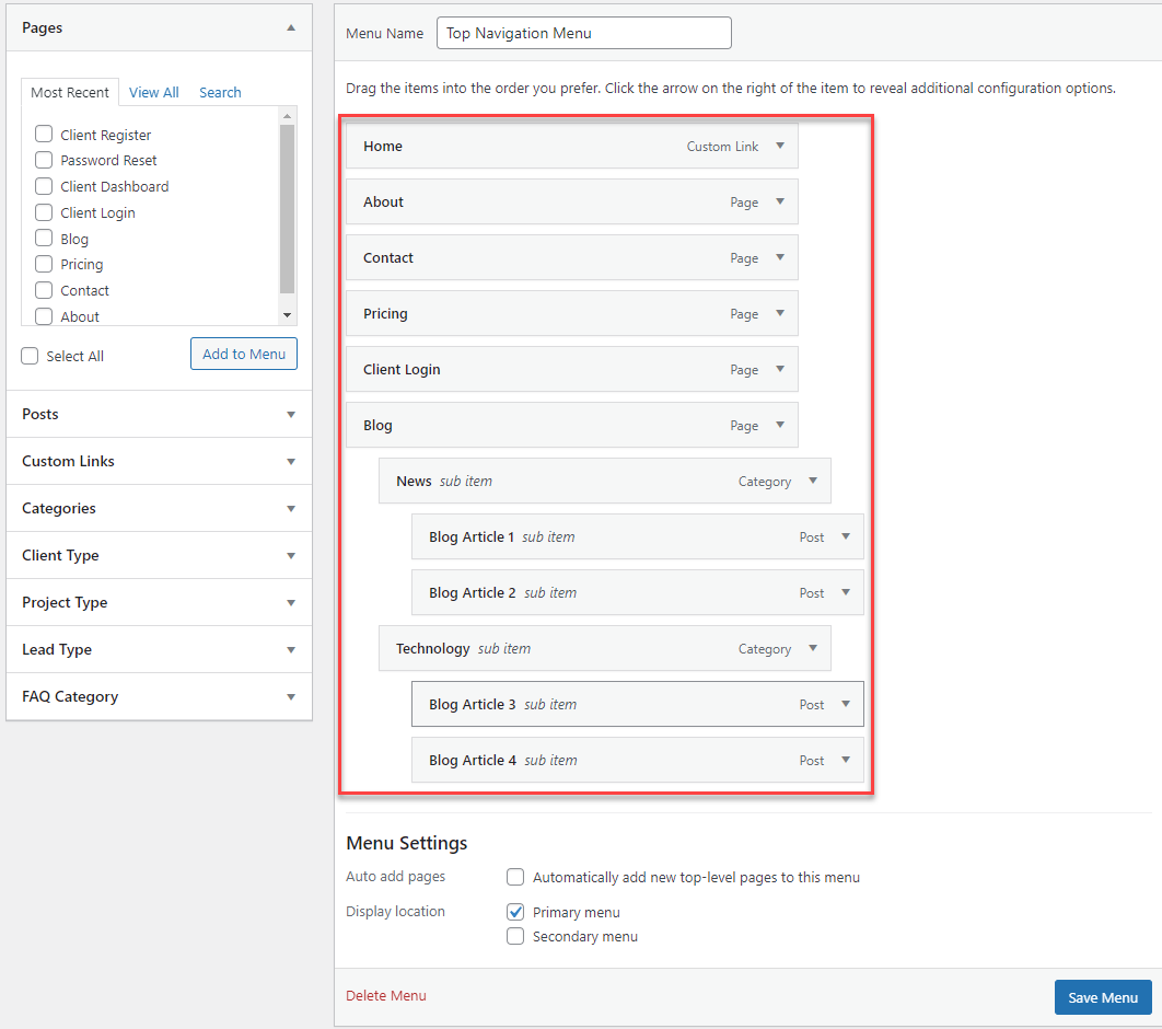
If your website has multiple categories or products/services you can display all these categories on the menu itself using the Mega Menu Function. Mega Menus is being used by many popular websites and is loved by users as they don’t have to search and jump multiple pages to find what’s required.
Did You Know?
Responsive Menu v4.1.2 Introduced Dark Mode Feature
Submenus can also be created using the responsive menu plugin to create it return to the Responsive Menu and click the “Customize” button beside your new menu.
Responsive Menu Customization window opens up, now click on Desktop Menu > Mega Menu Setup. Select the Menus that you want to be displayed on Desktop Devices.
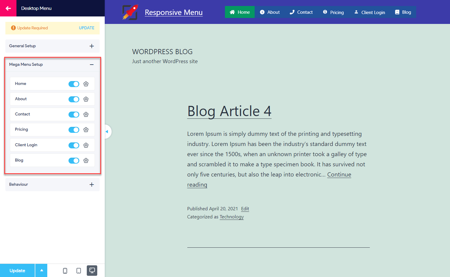
Further, each menu can be customized by adding more columns which can include links to pages, calendar, recent, archive, images, rss, categories, hyperlinks, etc.
You can also add a Drop Down effect to the Mega Menus and control its transition speed. By default the mega menus will become active and open up when a user scrolls over them, this can be controlled on the Behaviour section too.
Enable Responsive Header Bar
Responsive Menu Plugin allows you to enable a header bar automatically, just click on the header bar menu and then toggle the button that says “Enable Header Bar”.
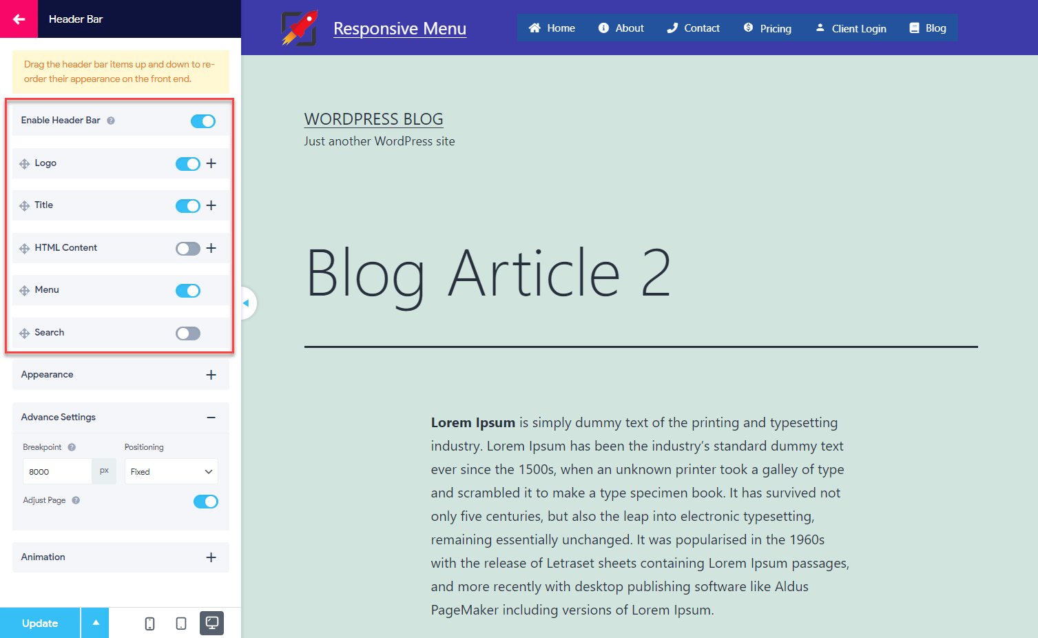
You can select what needs to be shown on this header bar, things like Logo, Title, HTML Content, Menus, Seach Fields can be displayed on the header bar.
Just toggle the button beside each option and that will be displayed automatically on your website. You can customize the header bar as needed by changing its background color, adjusting its height, adjusting the padding, etc.
The plugin also allows you to set the position of the header bar, you can set the header bar position as Fixed, Absolute, and Relative. You can even enable a different scrolling color to the header bar.
Keep in mind, that while setting colors to various options of the Responsive Menu you can even control the opacity/transparency of that particular section.
Conclusion
Responsive menus are a cornerstone of responsive design. They allow you to create one navigation structure that is intuitive across different devices and screen widths. You can determine where on the page your menu should be displayed, and change its presentation or behavior depending on the context of the rest of the page.
Hope this article helped you in building a better navigation menu on your website. The responsive menu is constantly being improved and newer features being added with every major release.
This article was just one of the many articles, that help you in building a better Responsive Menu Design on your WordPress website. Visit Responsive Menu Blog to find more.
You might also like: 9 Great WordPress Mega Menu Plugins for Better Site Navigation