
Menu Styling
Menu Styling
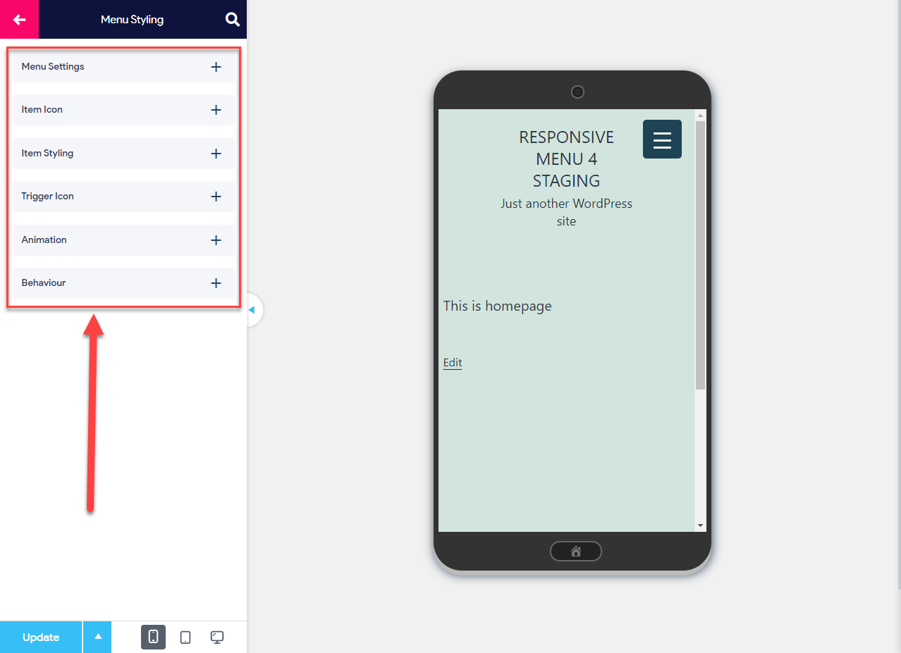
Menu Styling is the third Menu Customization option that you will find while customizing your Responsive Menu. It further consists of five Sub Menu options specifically:
- Menu Settings -With this option, you can change the menu background, its depth level, add a custom walker, and manage the menu padding.
- Item Icon – With this option, you can add the menu item icon to all the menu items of the desktop menu. Responsive Menu has a lot of amazing icons from various providers.
- Item Styling – With this option, you can style all the menu items, including the Top Level Menu and the Sub Menus by adjusting the Typography, Alignment, Color, and do much more.
- Trigger Icon – With this option you can set the Text /Icon/Image that will trigger the Menu Items.� Again, here you can customize the Text by adding text color, change the border color, and background making it look the best to suit your WordPress website.
- Animation – With this option, you can set the Menu item animation to both the top and sub menu levels and also adjust the animation speed.
- Behaviour – With this option you can enable the menus to display menus in collapsible accordion tabs, you can let the sub menus auto-expand, and set the sub items to expand on parent item click.
In the coming part of this documentation, you will learn more about what each submenu option further consists of and what is it intended to do.
Menu Styling – Menu Settings, Item Icon, Item Styling, Trigger Icon, Animation & Behaviour
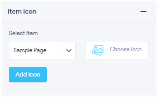
In Menu Styling’s Item Icon option, you can set a custom icon that will be displayed beside the menu item name for all the top-level menus.
You can also style the Top Level and Sub Menu Level items by adjusting the Item Height, Line Height, modify the font size, font family, adjust the font-weight, align the item text, manage letter spacing, and more.
You can also change the text color, background color, and the border-color of both the top-level menus and sub-menus.
1. Menu Settings
Menu – Settings
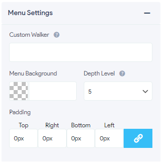
- Custom Walker – Lets you modify the HTML output by using a custom Walker class.
- Menu Background – Lets you set the menu background to any preferred color choice using the color picker
- Depth Level – Lets you set the level of nesting for sub-menus. You can go up to 5 menu depths
- Padding�
- Left – Lets you add Text Padding from the Left
- Top – Lets you add Text Padding from the Top
- Right – Lets you add Text Padding from the Right
- Botton – Lets you add Text padding form the Bottom
2. Item Icon
- Select Item – Lets you select the menu item and choose its required icon. �By default, you are presented with awesome icons from Dashicons, Material Icons (MDI), Font Awesome Solid (FAS), Font Awesome Brand (FAB), Font Awesome Regular (FAR), GlyphIcon, or choose your own custom icon. You can have multiple menu items set up with their respective item icons
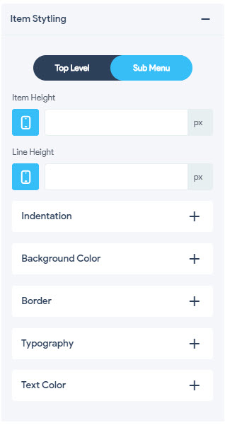
3. Item Styling

With the Item Styling Option, you can style all the menu items, including the Top Level Menu and the Sub Menus by adjusting the Typography, Alignment, Color, and do much more. This option consists of Menu Setting for Top Level Menu and Sub Menu.
Get all information regarding the Item Styling Option Here
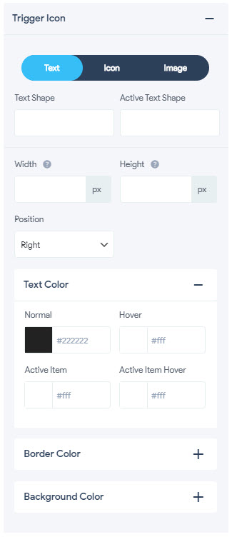
4. Trigger Icon
With this option, you can set the Text /Icon/Image that will trigger the Menu Items.� Again, here you can customize the Text by adding text color, change the border color, and background making it look the best to suit your WordPress website. Trigger Icon Menu consists of three more settings namely� Text, Icon, and Image customization options.
Get all information regarding the Trigger Icon Option Here
5. Animation
With this option, the top-level menu items appear with a fade-in animation to make the transition look more subtle and nuanced. Again, we can apply this animation effect to the Top Level and Sub Menu and define the appearance and tweak the transition speeds.
You can also add the animation to the sub menu items and make them slide over the top of each other.
Animation – Top Level Menu
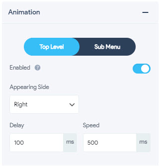
- Enabled – This option lets you make the individual menu items fade in when the button is clicked rather than simply appearing all at once
- Appearing Side – Specify the side where you would like the animation to appear from. You have the option of choosing from Left or Right Side
- Delay – It lets you delay the fade animation for entry and exit. You can make it delayed by entering values in milliseconds(ms)
- Speed – It lets you adjust the fade animation speed for entry and exit. You can adjust the speed by entering values in milliseconds(ms)
Animation – Sub Menu
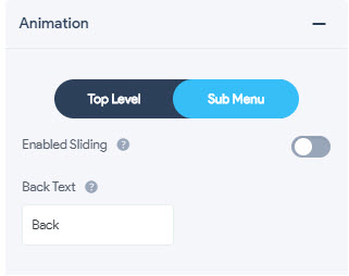
- Enabled Sliding – This option will add a slide effect to the sub menus. The slide effect changes the way the sub-menus open and close. Instead of the standard drop-down animation, they will slide over the top of each other
- Back Text – You can specify the text used for clicking to get back to the previous level when using the slide effect
6. Behaviour
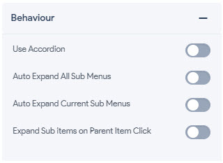
With this option you can enable the menus to display menus in collapsible accordion tabs, you can let the sub menus auto-expand, and set the sub items to expand on parent item click.
- Use Accordion – Enabling this option will enable the menus to display menus in collapsible accordion tabs
-
Auto Expand All Sub Menus – Enabling this option will auto expand all the sub menus even if the click on one of the sub menu items
-
Auto Expand Current Sub Menus – Enabling this option will auto-expand the current sub menu whenever the user clicks on that particular menu item
-
Expand Sub Items on Parent Item Click – Enabling this option will expand all the sub items if the parent menu is clicked by the user
Menu Styling – Item Styling
With the Item Styling Option, you can style all the menu items, including the Top Level Menu and the Sub Menus by adjusting the Typography, Alignment, Color, and do much more. This option consists of Menu Setting for Top Level Menu and Sub Menu.
1. Item Styling – Top Level
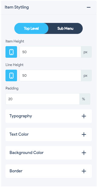
- Item Height – Lets you set the Item Height of all the top-level menu items. You can view the adjustments in real-time on the three device options by switching to the required device screen. You can set the item height to any size in pixels(px), percentage(%), emphasize(em), root em(rem), viewport width(vw), viewport height(vh) units
- Line Height -�Lets you set the Line Height of all the top-level menu items. You can view the adjustments in real-time on the three device options by switching to the required device screen. You can set the line height to any size in pixels(px), percentage(%), emphasize(em), root em(rem), viewport width(vw), viewport height(vh) units
- Padding – Lets you manage the Item Padding of all the top-level menus. You can set the padding in pixels(px), percentage(%), emphasize(em), root em(rem), viewport width(vw), viewport height(vh) units
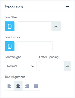
Typography
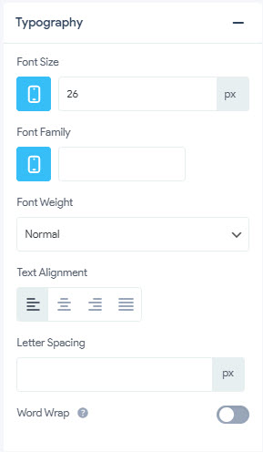
- Font Size -�Lets you set the Menu Item Font Size of all the top-level menu items. You can view the adjustments in real-time on the three device options by switching to the required device screen. You can set the font size to any size in pixels(px), percentage(%), emphasize(em), root em(rem), viewport width(vw), viewport height(vh) units
- Font Family – Here you need to mention the Font Family of the Menu Items which you want to display. You can view the adjustments in real-time on the three device options by switching to the required device screen
- Font Weight – Lets you set the Font Weight of all the top-level menu items. You can set the font-weight and choose from 100 – 900 units or keep it to Normal, Bold, Bolder, Lighter, Initial, and Inherit.
- Text Alignment – Lets you align the menu text as per the required position
- Letter Spacing – Lets you adjust the spacing between letters. You can set the spacing in pixels(px) unit only
- Word Wrap – Enabling this option lets you allow the menu items to wrap around to the next line.
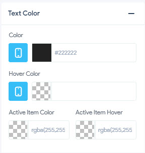
Text Color
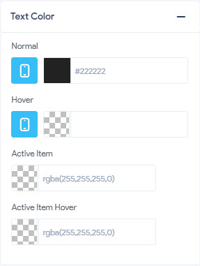
- Normal – Lets you set the normal/common color of the text that is in an Idle position without any user activity. Set it to any color of your choice using the color picker. You can view the adjustments in real-time on the three device options by switching to the required device screen
- Hover – Lets you set the hover color of the text that is in an Idle position. The color of the text changes to the set color when the user hovers the cursor over it.� Set it to any color of your choice using the color picker. You can view the adjustments in real-time on the three device options by switching to the required device screen
- Active Item – Lets you set the color of the Active Item that is in an Active position. It means when the Menu Item is in use the color changes to the set color. Set it to any color of your choice using the color picker.
- Active Item Hover – Lets you set the hover color of the Active Item that is in an Active position. It means when the user hovers the cursor over the active item the default color changes to the set color. Set it to any color of your choice using the color picker.
Background Color
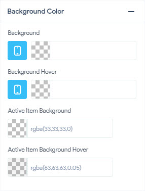
- Background – Lets you set the color of the Background Menu Items. Set it to any color of your choice using the color picker. You can view the adjustments in real-time on the three device options by switching to the required device screen
- Background Hover – Lets you set the color of the Background Hover on Menu Items. Set it to any color of your choice using the color picker. You can view the adjustments in real-time on the three device options by switching to the required device screen
- Active Item Background– Lets you set the background color of the Active Item that is in an Active position. It means when the Menu Item is in use the background color changes to the set color. Set it to any color of your choice using the color picker.
- Active Item Background Hover– Lets you set the background hover color of the Active Item that is in an Active position. It means when the user hovers the cursor over the active item the default background color changes to the set active background color. Set it to any color of your choice using the color picker.
Border
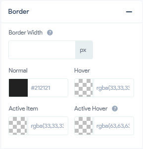
- Border – Lets you set the Menu Item Border to the specified size. You can set the border size to any size in pixels(px), percentage(%), emphasize(em), root em(rem), viewport width(vw), viewport height(vh) units
- Normal – Lets you set the normal/common border color of the Menu Item that is in an Idle position without any user activity. Set it to any color of your choice using the color picker.
- Hover – Lets you set the border hover color of the Menu item that is in an Idle position. The color of the menu border changes to the set color when the user hovers the cursor over it.� Set it to any color of your choice using the color picker.
- Active Item – Lets you set the border color of the Active Item that is in an Active position. It means when the Menu Item is in use the border color changes to the set color. Set it to any color of your choice using the color picker.
- Active Item Hover – Lets you set the border hover color of the Active Item that is in an Active position. It means when the user hovers the cursor over the active item the default border color changes to the set color. Set it to any color of your choice using the color picker.
2. Item Styling – Sub Menu
- Item Height – Lets you set the Item Height of all the sub menu items. You can view the adjustments in real-time on the three device options by switching to the required device screen. You can set the item height to any size in pixels(px), percentage(%), emphasize(em), root em(rem), viewport width(vw), viewport height(vh) units
- Line Height – Lets you set the Line Height of all the sub menu items. You can view the adjustments in real-time on the three device options by switching to the required device screen. You can set the line height to any size in pixels(px), percentage(%), emphasize(em), root em(rem), viewport width(vw), viewport height(vh) units
Indentation
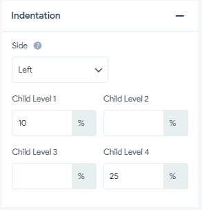
- Side – �Lets you define the side (either left or right) of the menu at which you want the padding should be on. You can set the padding to any size in pixels(px), percentage(%), emphasize(em), root em(rem), viewport width(vw), viewport height(vh) units
- Child Level 1 – �Lets you set the padding of the 1st level submenu items from the side as specified above. You can set the padding to any size in pixels(px), percentage(%), emphasize(em), root em(rem), viewport width(vw), viewport height(vh) units
- Child Level 2 – �Lets you set the padding of the 2nd level submenu items from the side as specified above. You can set the padding to any size in pixels(px), percentage(%), emphasize(em), root em(rem), viewport width(vw), viewport height(vh) units
- Child Level 3 – �Lets you set the padding of the 3rd level submenu items from the side as specified above. You can set the padding to any size in pixels(px), percentage(%), emphasize(em), root em(rem), viewport width(vw), viewport height(vh) units
- Child Level 4 – �Lets you set the padding of the 4th level submenu items from the side as specified above. You can set the padding to any size in pixels(px), percentage(%), emphasize(em), root em(rem), viewport width(vw), viewport height(vh) units
Background Color
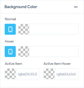
- Normal – Lets you set the normal/common background color of the sub menu that is in an Idle position without any user activity. Set it to any color of your choice using the color picker. You can view the adjustments in real-time on the three device options by switching to the required device screen
- Hover – Lets you set the background hover color of the sub menu that is in an Idle position. The background color of the sub menu changes to the set color when the user hovers the cursor over it.� Set it to any color of your choice using the color picker. You can view the adjustments in real-time on the three device options by switching to the required device screen
- Active Item – Lets you set the background color of the Active Item that is in an Active position. It means when the sub menu item is in use the color changes to the set color. Set it to any color of your choice using the color picker.
- Active Item Hover – Lets you set the hover color of the Active Item that is in an Active position. It means when the user hovers the cursor over the active sub menu item the default color changes to the set color. Set it to any color of your choice using the color picker.
Border
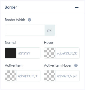
- Border Width – Lets you set the sub menu Item Border width to the specified size. You can set the border size to any size in pixels(px), percentage(%), emphasize(em), root em(rem), viewport width(vw), viewport height(vh) units
- Normal – Lets you set the normal/common border color of the sub menu Item that is in an Idle position without any user activity. Set it to any color of your choice using the color picker.
- Hover – Lets you set the border hover color of the sub menu item that is in an Idle position. The color of the sub menu border changes to the set color when the user hovers the cursor over it.� Set it to any color of your choice using the color picker.
- Active Item – Lets you set the border color of the Active Item that is in an Active position. It means when the sub menu Item is in use the border color changes to the set color. Set it to any color of your choice using the color picker.
- Active Item Hover – Lets you set the border hover color of the Active Item that is in an Active position. It means when the user hovers the cursor over the active sub menu item the default border color changes to the set color. Set it to any color of your choice using the color picker.
Typography
- Font Size – Lets you set the Menu Item Font Size of all the sub menu items. You can view the adjustments in real-time on the three device options by switching to the required device screen. You can set the font size to any size in pixels(px), percentage(%), emphasize(em), root em(rem), viewport width(vw), viewport height(vh) units
- Font Family – Here you need to mention the Font Family of the Sub Menu Items which you want to display. You can view the adjustments in real-time on the three device options by switching to the required device screen
- Font Weight – Lets you set the Font Weight of all the sub menu items. You can set the font-weight and choose from 100 – 900 units or keep it to Normal, Bold, Bolder, Lighter, Initial, and Inherit.
- Letter Spacing – Lets you adjust the spacing between letters. You can set the spacing in pixels(px) unit only
- Text Alignment – Lets you align the Sub Menu Text as per the required position
Text Color
- Color – Lets you set the normal/common color of the sub menu item text that is in an Idle position without any user activity. Set it to any color of your choice using the color picker. You can view the adjustments in real-time on the three device options by switching to the required device screen
- Hover Color – Lets you set the hover color of the text that is in an Idle position. The color of the text changes to the set color when the user hovers the cursor over it.� Set it to any color of your choice using the color picker. You can view the adjustments in real-time on the three device options by switching to the required device screen
- Active Item Color – Lets you set the color of the Active Item that is in an Active position. It means when the Sub Menu Item is in use the color changes to the set color. Set it to any color of your choice using the color picker.
- Active Item Hover – Lets you set the hover color of the Active Item that is in an Active position. It means when the user hovers the cursor over the sub menu active item the default color changes to the set color. Set it to any color of your choice using the color picker.
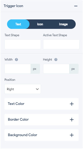
Menu Styling – Trigger Icon
With this option, you can set the Text /Icon/Image that will trigger the Menu Items.� Again, here you can customize the Text by adding text color, change the border color, and background making it look the best to suit your WordPress website. Trigger Icon Menu consists of three more settings namely� Text, Icon, and Image�customization options
1. Trigger Icon – Text
- Text Shape – Lets you set the Trigger Icon Text Shape
- Active Text Shape – Lets you set the Text Shape
- Width – Lets you set the width of the menu trigger item’s text. You can set the trigger menu item width to any size in pixels(px), percentage(%), emphasize(em), root em(rem), viewport width(vw), viewport height(vh) units
- Height -� Lets you set the height of the menu trigger item’s text. You can set the trigger menu item height to any size in pixels(px), percentage(%), emphasize(em), root em(rem), viewport width(vw), viewport height(vh) units
- Position – �Lets you fix the position of the Trigger Item Text on the set menu. You can define the position (either left or right) of the menu
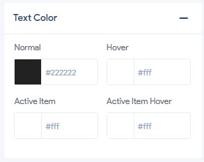
Text Color
- Normal � Lets you set the normal/common color of the trigger text that is in an Idle position without any user activity. Set it to any color of your choice using the color picker.
- Hover � Lets you set the hover color of the trigger text that is in an Idle position. The color of the text changes to the set color when the user hovers the cursor over it.� Set it to any color of your choice using the color picker.
- Active Item � Lets you set the color of the Active Item Text that is in an Active position. It means when the Menu Item is in use the text color changes to the set color. Set it to any color of your choice using the color picker.
- Active Item Hover � Lets you set the hover color of the Active Item Text that is in an Active position. It means when the user hovers the cursor over the active item text the default color changes to the set color. Set it to any color of your choice using the color picker.
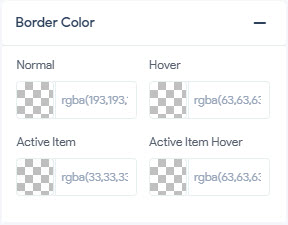
Border Color
- Normal � Lets you set the normal/common border color of the Menu Trigger Text that is in an Idle position without any user activity. Set it to any color of your choice using the color picker.
- Hover � Lets you set the border hover color of the Menu Trigger Text that is in an Idle position. The color of the Menu Trigger Text changes to the set color when the user hovers the cursor over it.� Set it to any color of your choice using the color picker.
- Active Item � Lets you set the border color of the Active Menu Trigger Text that is in an Active position. It means when the Menu Item is in use the Menu Trigger Text color changes to the set color. Set it to any color of your choice using the color picker.
- Active Item Hover � Lets you set the border hover color of the Menu Trigger Text that is in an Active position. It means when the user hovers the cursor over the active item the default Menu Trigger Text color changes to the set color. Set it to any color of your choice using the color picker.
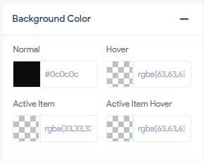
Background Color
- Normal � Lets you set the normal/common background color of the Menu Trigger Text that is in an Idle position without any user activity. Set it to any color of your choice using the color picker.
- Hover � Lets you set the background hover color of the Menu Trigger Text that is in an Idle position. The background color of the Menu Trigger Text changes to the set color when the user hovers the cursor over it.� Set it to any color of your choice using the color picker.
- Active Item � Lets you set the background color of the Active Item that is in an Active position. It means when the Menu Trigger Text item is in use the color changes to the set color. Set it to any color of your choice using the color picker.
- Active Item Hover � Lets you set the hover color of the Active Item that is in an Active position. It means when the user hovers the cursor over the active Menu Trigger Text item the default color changes to the set color. Set it to any color of your choice using the color picker.
2. Trigger Icon – Icon
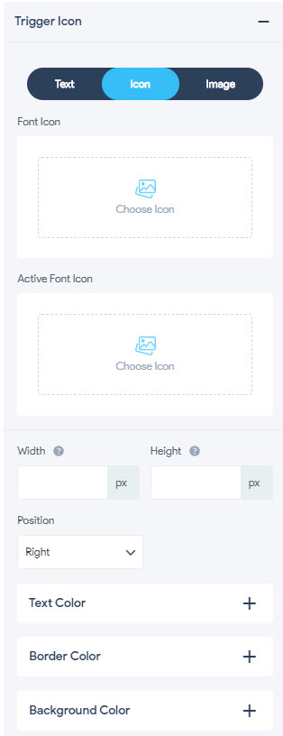
- Font Icon � Lets you choose a Custom Trigger Font Icon instead of the standard icon. By default, you are presented with awesome icons from Dashicons, Material Icons (MDI), Font Awesome Solid (FAS), Font Awesome Brand (FAB), Font Awesome Regular (FAR), GlyphIcon, or choose your own custom icon
- Active Font Icon � Lets you set a Custom Active Trigger Font Icon instead of the standard icon. This icon will be displayed when the menu is triggered. By default, you are presented with awesome icons from Dashicons, Material Icons (MDI), Font Awesome Solid (FAS), Font Awesome Brand (FAB), Font Awesome Regular (FAR), GlyphIcon, or choose your own custom icon
- Width – Lets you set the width of the menu trigger item’s icon. You can set the trigger menu item width to any size in pixels(px), percentage(%), emphasize(em), root em(rem), viewport width(vw), viewport height(vh) units
- Height -� Lets you set the height of the menu trigger item’s icon. You can set the trigger menu item height to any size in pixels(px), percentage(%), emphasize(em), root em(rem), viewport width(vw), viewport height(vh) units
- Position – �Lets you fix the position of the Trigger Item Icon on the set menu. You can define the position (either left or right) of the menu
Text Color
- Normal � Lets you set the normal/common color of the trigger icon text that is in an Idle position without any user activity. Set it to any color of your choice using the color picker.
- Hover � Lets you set the hover color of the trigger icon text that is in an Idle position. The color of the text changes to the set color when the user hovers the cursor over it.� Set it to any color of your choice using the color picker.
- Active Item � Lets you set the color of the Active Item Text that is in an Active position. It means when the Menu Item is in use the trigger icon text color changes to the set color. Set it to any color of your choice using the color picker.
- Active Item Hover � Lets you set the hover color of the Active Item Text that is in an Active position. It means when the user hovers the cursor over the active item text the default trigger icon text color changes to the set color. Set it to any color of your choice using the color picker.
Border Color
- Normal � Lets you set the normal/common border color of the Menu Trigger Icon that is in an Idle position without any user activity. Set it to any color of your choice using the color picker.
- Hover � Lets you set the border hover color of the Menu Trigger Icon that is in an Idle position. The color of the Menu Trigger Icon changes to the set color when the user hovers the cursor over it.� Set it to any color of your choice using the color picker.
- Active Item � Lets you set the border color of the Active Menu Trigger Icon that is in an Active position. It means when the Menu Item is in use the Menu Trigger Icon color changes to the set color. Set it to any color of your choice using the color picker.
- Active Item Hover � Lets you set the border hover color of the Menu Trigger Icon that is in an Active position. It means when the user hovers the cursor over the active item the default Menu Trigger Icon color changes to the set color. Set it to any color of your choice using the color picker.
Background Color
- Normal � Lets you set the normal/common background color of the Menu Trigger Icon that is in an Idle position without any user activity. Set it to any color of your choice using the color picker.
- Hover � Lets you set the background hover color of the Menu Trigger Icon that is in an Idle position. The background color of the Menu Trigger Icon changes to the set color when the user hovers the cursor over it.� Set it to any color of your choice using the color picker.
- Active Item � Lets you set the background color of the Active Item that is in an Active position. It means when the Menu Trigger Icon item is in use the color changes to the set color. Set it to any color of your choice using the color picker.
- Active Item Hover � Lets you set the hover color of the Active Item that is in an Active position. It means when the user hovers the cursor over the active Menu Trigger Icon item the default color changes to the set color. Set it to any color of your choice using the color picker.
3. Trigger Icon – Image
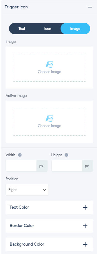
- Image � Lets you choose a custom Image instead of the standard icon/text. You will have the option to choose an image from your WordPress Media Library or upload a new image and display it as a button.
- Active Image � Lets you set a custom Active Image instead of the standard icon/text. This image will be displayed when the menu item is triggered. You will have the option to choose an image from your WordPress Media Library or upload a new image and display it as an active image.
- Width – Lets you set the width of the menu trigger item’s image. You can set the trigger menu item image width to any size in pixels(px), percentage(%), emphasize(em), root em(rem), viewport width(vw), viewport height(vh) units
- Height -� Lets you set the height of the menu trigger item’s image. You can set the trigger menu item image height to any size in pixels(px), percentage(%), emphasize(em), root em(rem), viewport width(vw), viewport height(vh) units
- Position – �Lets you fix the position of the Trigger Item image on the set menu. You can define the position (either left or right) of the menu
Text Color
- Normal � Lets you set the normal/common color of the trigger image text that is in an Idle position without any user activity. Set it to any color of your choice using the color picker.
- Hover � Lets you set the hover color of the trigger image text that is in an Idle position. The color of the text changes to the set color when the user hovers the cursor over it.� Set it to any color of your choice using the color picker.
- Active Item � Lets you set the color of the Active Item Image Text that is in an Active position. It means when the Menu Item is in use the trigger icon text color changes to the set color. Set it to any color of your choice using the color picker.
- Active Item Hover � Lets you set the hover color of the Active Item Image Text that is in an Active position. It means when the user hovers the cursor over the active item text the default trigger image text color changes to the set color. Set it to any color of your choice using the color picker.
Border Color
- Normal � Lets you set the normal/common border color of the Menu Trigger Image that is in an Idle position without any user activity. Set it to any color of your choice using the color picker.
- Hover � Lets you set the border hover color of the Menu Trigger Image that is in an Idle position. The color of the Menu Trigger Image changes to the set color when the user hovers the cursor over it.� Set it to any color of your choice using the color picker.
- Active Item � Lets you set the border color of the Active Menu Trigger Image that is in an Active position. It means when the Menu Item is in use the Menu Trigger Image color changes to the set color. Set it to any color of your choice using the color picker.
- Active Item Hover � Lets you set the border hover color of the Menu Trigger Image that is in an Active position. It means when the user hovers the cursor over the active item the default Menu Trigger Image color changes to the set color. Set it to any color of your choice using the color picker.
Background Color
- Normal � Lets you set the normal/common background color of the Menu Trigger Image that is in an Idle position without any user activity. Set it to any color of your choice using the color picker.
- Hover � Lets you set the background hover color of the Menu Trigger Image that is in an Idle position. The background color of the Menu Trigger Image changes to the set color when the user hovers the cursor over it.� Set it to any color of your choice using the color picker.
- Active Item � Lets you set the background color of the Active Item that is in an Active position. It means when the Menu Trigger Image item is in use the color changes to the set color. Set it to any color of your choice using the color picker.
- Active Item Hover � Lets you set the hover color of the Active Item that is in an Active position. It means when the user hovers the cursor over the active Menu Trigger Image item the default color changes to the set color. Set it to any color of your choice using the color picker.