
Mobile Menu
Mobile Menu is the first Menu Customization option that you will find while customizing your Responsive Menu. It further consists of two Sub Menu options specifically:
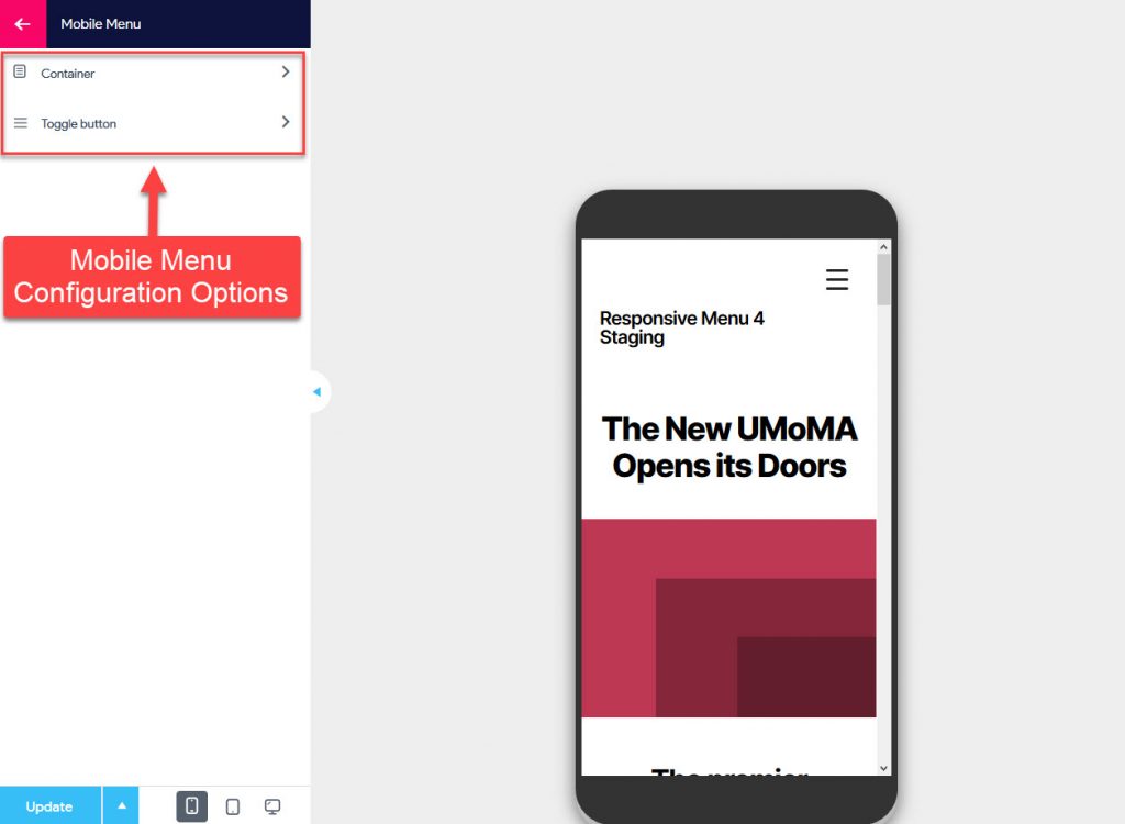
- Container -� where you can find all its container items and appearance plus behavior settings to manage the Menu Container. And,
- Toggle Button – which consists of styling, positioning, formatting, and making behavioral adjustments to the hamburger menu.
In the coming documentation part, we will learn what each submenu option further consists of and what is it intended to do.
Container and Container Items

A container is the one that opens up when you click on the hamburger menu. The container can be configured to display the required container items on it. You can set up the container to display a Custom Container Title, Menus, Search Bar, and any Additional Content of your choice.
Title
1. Title – Contents

Enabling this option will let you display a Container Title along with a hyperlink or with a Container Image.
- Title Text � Lets you display a title Text
- Link � Lets you to set up a container link
- Link Target � After setting up the link you can target it to open up on the same page, a new tab, a parent page, or opens-up the intended page utilizing the full Window Body of the web browser.
- Image � Lets you display an image on the container
- Set Font � Lets you display a Font Icon. By default, you are presented with awesome icons from Dashicons, Material Icons (MDI), Font Awesome Solid (FAS), Font Awesome Brand (FAB), Font Awesome Regular (FAR), GlyphIcon, or choose your own custom icon
2. Title – Styles

The Title Styles Tab involves Text Formatting options like Font Size, Text Alignment, Text Color, Text Hover Color, Background Color, Background Hover Color, Image Width, Image Height of the Title.
- Padding�
- Left – Lets you add Text Padding from the Left
- Top – Lets you add Text Padding from the Top
- Right – Lets you add Text Padding from the Right
- Botton – Lets you add Text padding form the Bottom
- Background � Lets you set the text background color to any color of your choice using the color picker
- Background Hover � Lets you set the text background hover color to any color of your choice using the color picker
- Font Size � Lets you adjust the Title Font Size inpixels(px), percentage(%), emphasize(em), root em(rem), viewport width(vw), viewport height(vh) units
- Text Alignment � Lets you align the title text as per the required position
- Text Color �� Lets you set the text color to any color of your choice using the color picker
- Text Hover � Lets you set the text hover color to any color of your choice using the color picker
- Image Width � Lets you adjust the set Image Width to any size in pixels(px), percentage(%), emphasize(em), root em(rem), viewport width(vw), viewport height(vh) units
- Image Height � Lets you adjust the set Image Height to any size in pixels(px), percentage(%), emphasize(em), root em(rem), viewport width(vw), viewport height(vh) units
Menu
Padding setting moved to Menu Styling > Menu Settings
Search
1. Search � Contents

By Enabling the Search option you can display a Search Box inside the Menu Container. You have the option to set a custom search code you can use shortcode or HTML for a custom search form. You can add a custom search form HTML code or you can use a third-party plugin shortcode to show the search form.
- Placeholder Text � It is the text that is displayed inside the search box to guide the user with a sample search text.
- Custom Search Code – Enter the custom form code which displays custom search results based on the search term and its scope. Example: If you are running a WooCommerce store, you can change the default WordPress search for the Advanced Woo Search plugin shortcode for more control of the search results and relevance of the results.
2. Search � Styles

Styles consist of various color options that are required to customize the search bar. You can find the below color options:
- Padding�
- Left – Lets you add Search Box Padding from the Left
- Top – Lets you add Search Box Padding from the Top
- Right – Lets you add Search Box Padding from the Right
- Botton – Lets you add Search Box padding form the Bottom
- Height – Lets you adjust the search bar height. You can adjust the height in pixels(px), percentage(%), emphasize(em), root em(rem), viewport width(vw), viewport height(vh) units
- Border Radius – Lets you set the border radius of the Search bar. You can set the border-radius only in pixels(px)
- Text Color � It is the color of the text that will be searched by the user. Set it to any color of your choice using the color picker
- Background Color � It is the background color of the search box. Set it to any color of your choice using the color picker
- Placeholder Color � It is the color of the placeholder that will be displayed to the user. Set it to any color of your choice using the color picker
- Border Color �� It is the color of the border of the search box. Set it to any color of your choice using the color picker
Additional Content
1. Additional Content � Contents

Enabling the Additional Contents option lets you insert additional content of your choice inside the container. You can display your content by adding it inside the Content Text Area.
2. Additional Content � Styles

You can style your additional content by adjusting the content font size, align the text as per your requirement, and add colors to match it with the existing container color scheme.
- Padding�
- Left – Lets you add the additional content’s Padding from the Left
- Top – Lets you add the additional content’s Padding from the Top
- Right – Lets you add the additional content’s Padding from the Right
- Botton – Lets you add the additional content’s padding form the Bottom
- Font Size � Lets you adjust the font size of the additional content to any size in pixels(px), percentage(%), emphasize(em), root em(rem), viewport width(vw), viewport height(vh) units
- Text Alignment � Lets you align the additional content as per the required position
- Text Color �� Lets you set the Additional content�s color to any color of your choice using the color picker
Note: You can adjust the chronology of the container items by dragging specific container items upwards and downwards as per your requirement to best suit your website.
Appearance

After Setting up the container items now, you need to fix the appearance of the Container. You can adjust its width, Set Maximum Width, Minimum Width, Limit the container height, alter container background color, add a background image, set the animations type and directions, and finally add a CSS Selector that needs to be pushed while enabling push animations.
- Width � Adjust the width of the container which it occupies when triggered by the hamburger menu. You can set the width to any size in pixels(px), percentage(%), emphasize(em), root em(rem), viewport width(vw), viewport height(vh) units
- Maximum Width � Specify the maximum width taken by the container. You can set the maximum width to any size inpixels(px), percentage(%), emphasize(em), root em(rem), viewport width(vw), viewport height(vh) units
- Minimum Width �� Specify the minimum width taken by the container. You can set the minimum width to any size in pixels(px), percentage(%), emphasize(em), root em(rem), viewport width(vw), viewport height(vh) units
- Auto Height � Enabling this option will let you limit the container height up to the last container element
- Padding
- Left � Lets you add the additional content�s Padding from the Left
- Top � Lets you add the additional content�s Padding from the Top
- Right � Lets you add the additional content�s Padding from the Right
- Bottom � Lets you add the additional content�s padding from the Bottom.
- Container Background � Lets you set the Container background-color. Set it to any color of your choice using the color picker
- Background Image � Lets you set a background image to the Container
- Use Gradient Color – Toggle this button to enable gradient color in the menu container.
- Gradient Colors – This lets you set and choose between the two-color gradients. Set it to any color of your choice using the color picker.
- Gradient Type – Set the Gradient Form Type, you can choose between two options Linear (Horizontal) and Radial (Circular).
- Gradient Direction – Lets you Control the Gradient Direction by adjusting the slider.
- Start Position – Lets you adjust the Start Position of the Gradient by adjusting the slider.
- End Position – Lets you adjust the End Position of the Gradient by adjusting the slider.
- Animation
- Direction � Lets you set the container Animation Effect. You can choose between sides � Left, Right, Top, Bottom to slide-in and slide-out the container
- Type � Lets you select the type of animation for it to perform for bringing the container in and out. You can choose from animations like Push, Slide, and Fade
- Transition delay � It lets you to adjust the speed of animation for container entry and exit. You can set the preferred speed in seconds
- Push Wrapper � Lets you mention the CSS selector of the main element that will be pushed when using push animations
Behaviour

With these options, you can manage the behaviour of the container by hiding the menu on page clicks, page scroll,� and link clicks. You can also enable the touch gestures and Keyboard Controls for better accessibility.
- Hide Menu On
- Page Click � Enabling this option will hide the container and all its elements whenever the user clicks anywhere on the page
- Page Scroll � Enabling this option will hide the container and all its elements whenever the user scrolls on the page
- Link Clicks � Enabling this option will hide the container and all its elements whenever the user clicks any links on the page
- Enable Touch Gestures � Enabling this option lets you to drag or swipe to close the container on touch devices eg. Smartphones, Tablets, or Touch supported Laptops.
- Keyboard Controls
- Hide Menu � With this option whenever a user hits a specific button on the keyboard the Container will be hidden. You can set the menu to be dropped when Esc, Enter, Space, Left, Up, Right, Down keystroke is detected.
- Show Menu � With this option whenever a user hits a specific button on the keyboard the Container will be shown. You can set the menu to be raised when Esc, Enter, Space, Left, Up, Right, Down keystroke is detected.
Mobile Menu – Toggle Button
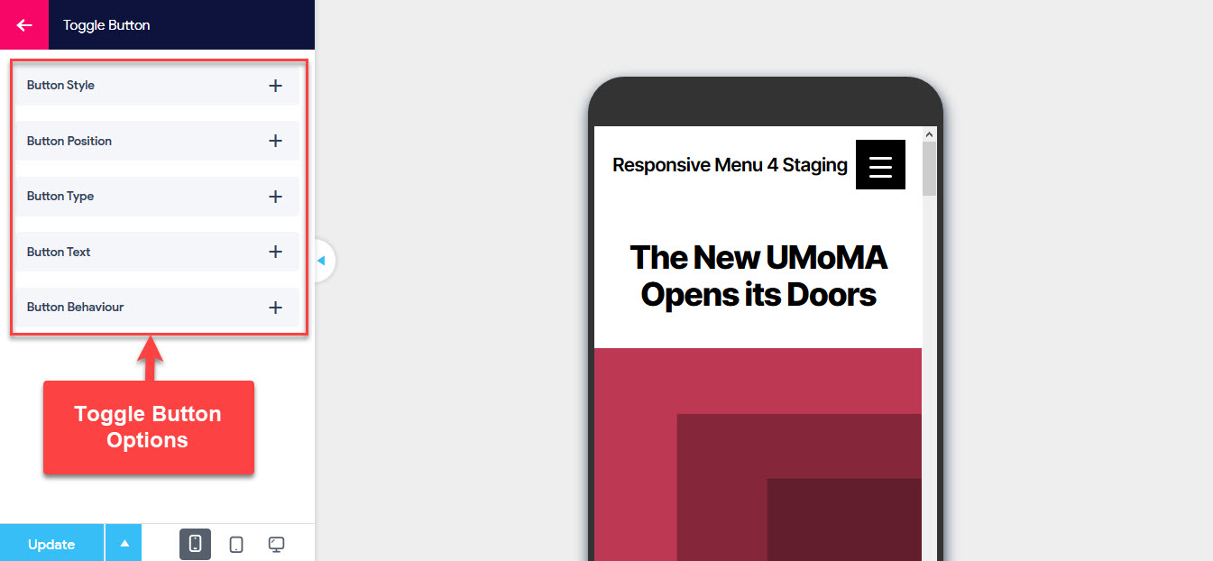
Toggle Button Options consists of options that are important for the configuration of the Toggle Button. You set the Hamburger menu breakpoints along with the button style, type, and positioning. It also has the option to display a button text beside the menu icon/image. You also can set up the button behaviour and configure how you want the hamburger menu to behave to the user action.
Note: We have removed the hamburger breakpoint option and now onwards tablet breakpoint will work as hamburger breakpoint (or maximum toggle menu/mobile menu/hamburger menu breakpoints)
Button Style

With these options, you can adjust the button style by altering the button�s container width and its container height. You also have the option to adjust the button�s color along with its background color, background hover color, and its active color. You can also have a transparent hamburger button background.
- Container Width � Lets you adjust the width of the button container to any specific size. You can set the width to any size in pixels(px), percentage(%), emphasize(em), root em(rem), viewport width(vw), viewport height(vh) units
- Container Height �� Lets you adjust the height of the button container to any specific size. You can set the width to any size in pixels(px), percentage(%), emphasize(em), root em(rem), viewport width(vw), viewport height(vh) units
- Background Color � Lets you set the color of the button container. Set it to any color of your choice using the color picker
- Background Hover � Lets you set the background hover color of the button container. Set it to any color of your choice using the color picker
- Active Color � Lets you set the Active color of the button container. It is displayed when the user hits the hamburger menu button to open the menu. Set it to any color of your choice using the color picker
- Transparent Background � Enabling this option will let you set the button container with a transparent background
Button Position

Adjust the hamburger menu button position within the webpage. You can choose which side you need the button to appear,� specify its position, and adjust its distance from the side and also from the top of the webpage. You can also set the button to slide with the menu container when triggered.
- Side � Lets you specify the side where you need the button to be ideally displayed. You can set the side to Left or Right
- Position � This option lets you set the positioning of the header bar. The dropdown offers you 3 different options on how you want to display the hamburger button when the user scrolls down the page. With Fixed positioning, the hamburger button will stay in place as you scroll down the page. With Absolute positioning, the hamburger button will disappear as you scroll down the page. With Relative positioning, the hamburger button will stay in a specific position on the page. Relative Positioning is useful when used with the shortcode.
- Distance from Side � Lets you specify how far from the side you need the button to be displayed. You can set the distance in pixels(px), percentage(%), emphasize(em), root em(rem), viewport width(vw), viewport height(vh) units
- Distance from Top � Lets you specify how far from the top you need the button to be displayed. You can set the distance in pixels(px), percentage(%), emphasize(em), root em(rem), viewport width(vw), viewport height(vh) units
- Push Button with Menu � Enabling this option lets you make the toggle button to slide along with the menu container when triggered.
Button Type
1. Button Type � Hamburger

Button Type lets you set the visual appearance of the hamburger button by using a number of animation options and adjusting its spacing from within plus coloring the lines for various scenarios.
- Animation � Lets you choose the perfect hamburger animation from an array of animation effects. You can choose from 27 animation effects.
- Line Spacing � Lets you set the margin between each individual button line. You can set the line spacing of any size in pixels(px), percentage(%), emphasize(em), root em(rem), viewport width(vw), viewport height(vh) units
- Line Width � Lets you set the width of each individual button line. You can set the line width to any size in pixels(px), percentage(%), emphasize(em), root em(rem), viewport width(vw), viewport height(vh) units
- Line Height � Lets you set the height of each individual button line. You can set the line height to any size in pixels(px), percentage(%), emphasize(em), root em(rem), viewport width(vw), viewport height(vh) units
- Line Color � Lets you set the color for all three hamburger lines. Set it to any color of your choice using the color picker
- Line Hover � Lets you set the line hover color for all three hamburger lines. Set it to any color of your choice using the color picker
- Line Active � Lets you set the line active color for all three hamburger lines. Set it to any color of your choice using the color picker. You can view the active color only when the mobile menu is triggered.
2. Button Type � Icon
This option lets you add a custom icon in place of the regular(3 Horizontal Lines) hamburger icon.
- Font Icon � Lets you choose a custom font icon instead of the standard hamburger lines. By default, you are presented with awesome icons from Dashicons, Material Icons (MDI), Font Awesome Solid (FAS), Font Awesome Brand (FAB), Font Awesome Regular (FAR), GlyphIcon, or choose your own custom icon
- Active Font Icon � Lets you set a custom active font icon instead of the standard hamburger lines. This icon will be displayed when the hamburger menu is triggered. By default, you are presented with awesome icons from Dashicons, Material Icons (MDI), Font Awesome Solid (FAS), Font Awesome Brand (FAB), Font Awesome Regular (FAR), GlyphIcon, or choose your own custom icon
3. Button Type � Image

This option lets you add a custom image in place of the regular(3 Horizontal Lines) hamburger icon.
- Image � Lets you choose a custom Image instead of the standard hamburger lines. You will have the option to choose an image from your WordPress Media Library or upload a new image and display it as a button.
- Active Image � Lets you set a custom Active Image instead of the standard hamburger lines. This image will be displayed when the hamburger menu is triggered. You will have the option to choose an image from your WordPress Media Library or upload a new image and display it as an active image.
Button Text

This option lets you set the Button Text along with the Hamburger Menu Icon or Image. You can set any text to be displayed alongside the hamburger menu. You can position this button text around the hamburger icon /Image and adjust its font size, line height, and text color. You also have the option to choose the font family.
- Text � Here you require to enter the button text that you want to display with the hamburger menu. The added text will be displayed along with a hamburger icon/image (depending on your configuration) when the button is idle or in an inactive state.
- Active Text �� Here you require to enter the active button text that you want to display with the hamburger menu. The added text will be displayed along with a hamburger icon/image (depending on your configuration) when the button is in the inactive state.
- Text Position � Here you need to specify the position of the button text to be displayed. This text position will be positioned around the icon/image that you have already set. You have the options of Top, Left, Bottom, and, Right for positioning.
- Font Family � Here you need to mention the font family of the text which you want to display.
- Font Size � Lets you adjust the Title Font Size of the button text in pixels(px), percentage(%), emphasize(em), root em(rem), viewport width(vw), viewport height(vh) units
- Line Height � Lets you adjust the set Button Text Height to any height in pixels(px), percentage(%), emphasize(em), root em(rem), viewport width(vw), viewport height(vh) units
- Text Color � Here you need to specify the Button Text Color. The color specifically needs to be in its hexadecimal code.
Button Behaviour

This option lets you manage the button behaviour that lets you toggle the button by click or by just hovering over the hamburger menu button. You also have the option to add a custom toggle selector for the hamburger menu.
- Toggle menu on click � Enabling this option will let you fire-up the responsive menu by clicking on the Toggle Button.
- Toggle menu on hover � Enabling this option will let you fire-up the responsive menu by just hovering the cursor over the Toggle Button.
- Custom Toggle Selector � With this option, you can set your own container trigger by specifying the CSS selector. If you don�t want to use the button that comes with the menu, you can specify your own container trigger here. Any CSS selector is accepted.