
Oshine RM Theme
Oshine RM Theme has a unique push layer-stack style menu that comes into effect when the user interacts with the menu toggle button and opens up the menu container. By default, it has a Green Color Background
Want to how the theme would actually look like on a website? Check out the�Oshine RM Theme Demo and see yourself.
With the Oshine RM Theme, we have introduced two new theme options that can be used to modify theme settings.
- Theme Details: It consists of the current theme details like the Theme Name, a snapshot, and an option to change the theme.
- Change Theme: Using this you can change the theme to any other Free or Pro themes that you’ve purchased.
- Save As Theme(Template): Using this option you can save any theme with its currently used settings and configuration like the Menu Color being used, Menu Title Configuration, The current Appearance, etc. in a Template. This way you can have many templates with different customizations and settings and can later use the saved settings by navigating to Change Themes > Templates.
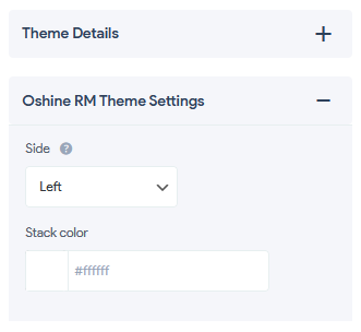
- Oshine RM Theme Settings:
- Slide:
- Left: The menu toggle button will appear on the left and the menu container will also slide-in from the left. Also, the menu items will toggle from the Left to the Right inside the container.
- Right: The menu toggle button will appear on the right and the menu container will also slide-in from the right. Also, the menu items will toggle from the Left to the Right inside the container.
- Stack Color: The theme allows you to change the Stack Effect Color when the menu button is toggled. You see a beautiful layer stack when the menu is active. You can set the color to any of your preferred colors according to your website’s background or color scheme. You can set the color using the color palette.
- Slide:
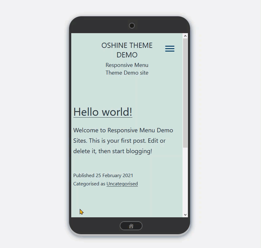
The effect remains the same in all three device options i.e Mobile Device, Tablet, or Desktop Device.
Customize the Search Box by changing its border color, placeholder color, text color, and background color by navigating to Mobile Menu> Container > Search. Using the Responsive Menu Customization Options you can customize the theme much more.
Using the Container Option you can sync additional content like adding Social Media Icons, Email, Phone or any other links or details can be added or else turn off the Additional Content Option if not required.
Also, you can change other Menu Settings like the Container Appearance Background Color to any color of your choice or go with a background image.
You can also change the menu item styling too like the Item Height, Line Height, Padding, Typography, Text Color, Background Color, Border, etc. Thus you can set the color scheme and the appearance depending on your website’s color scheme to make it a perfect match and equally attractive.
Note: By default, the Container Animation is set to Type Push. It is recommended to keep the container animation type to Push. Though changing it to any other type won’t cause any harm to the menu but it affects the menu behavior as the theme is made to push open the menu by pushing site contents.
Also, the Oshine RM Theme is compatible with Responsive Menu v4.1.0 and above. If you are any of the lower Responsive Menu versions then it is recommended to upgrade to the latest version to enjoy the Oshine RM Theme on your website.
�