
Settings
Settings
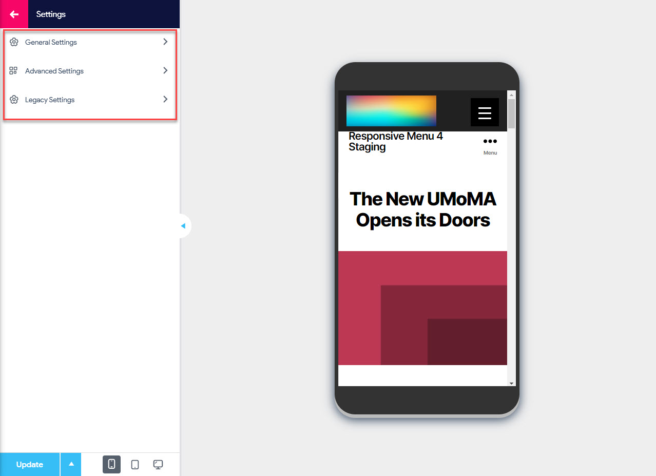
Settings are the sixth and the last Menu Customization option that you will find while customizing your Responsive Menu. It further consists of three Sub Menu options specifically:
- General Settings – In this Settings option, you can set the Menu Settings like the Menu Name, Choose WP Menu that you want to use, set the menu to be displayed on mobile and tablet, manage Device Visibility, configure the menu to display on the pages or exclude them from showing in some pages and you also have the option to hide current theme menu
- Advanced Settings – In this Settings option, you can adjust the breakpoints on Mobile and Tablet devices, Set the animation speeds on colors and sub menus, set the menu to be triggered on page load, disable Background Scrolling� and configure the page overlay settings
- Legacy Settings – In this Settings option, you can set the theme location menu instead of a specific menu, and configure the visual appearances of sub level menu trigger by adjusting the width, height, position, background color, border color, and arrow text color.
Settings – General Settings
Menu Settings
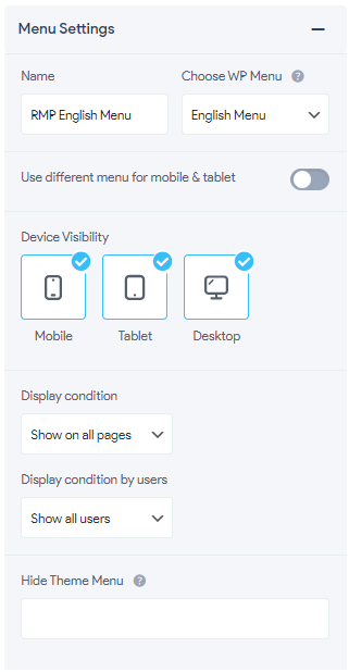
- Name – Set the Menu Name to your preferred choice
- Choose WP Menu – This option lets you choose the previously configured WP Menu for the Responsive Menu. The dropdown will list all the WordPress menus that you have created. If no options appear here, make sure you have set them up under Appearance > Menus. Please note that the Theme Location option will take precedence over this.
-
Use the different menu for mobile & tablet – If this option is enabled you can use different menus for mobile and tablet devices
-
Mobile & Tablet Menu – With this option you can use the chosen WordPress menu for Mobile and Tablet Devices. The dropdown will list all the WordPress menus that you have created. If no options appear here, make sure you have set them up under Appearance > Menus. Please note that the Theme Location option will take precedence over this.
- Device Visibility – With this option, you can choose on what devices you want the responsive menu to be displayed. You can choose from Mobile, Tablet, and Desktop Devices.
- Display Configuration – With this option, you can choose where you would want to display the Responsive Menu. You have the options like Show on all pages, Exclude some pages, Include Only pages, and Use as a shortcode.
- Show on all pages – Shows menu on all pages
- Exclude some pages -� Excludes menu on the chosen pages
- Include only pages – Includes menu only on the chosen pages
- Parent & child pages – Include menu on the chosen parent and child pages
- Use as shortcode – Include menu on a page using a shortcode
- Display Condition by users – With this option, you can implement different menus for different users. You have the options like Show all users, Only logged in users, Only guest users.
- Show all users –� Menu will be shown to all users
- Only logged in users – Menu will be shown only to logged-in users
- Only guest users – Menu will be shown only to guest users
- Select Pages – Depending on the chosen Display Condition you can select pages where you want to display the Responsive Menu. Example: If you don’t want to display the menu on some pages then you need to set the display condition as “Exclude some pages” and select all those pages in the select pages option.
- Hide Theme Menu – With this option, you can hide your current theme menu. To hide your current theme menu you need to put the CSS selector here. Any legal CSS selection criteria are valid. To know more visit this tutorial on Hiding Original WordPress Menu.
Settings – Advanced Settings
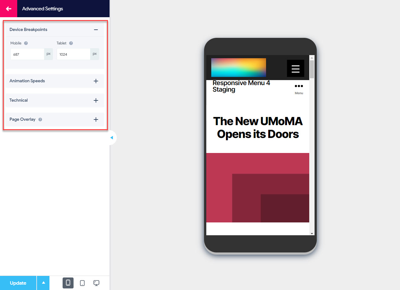
Device Breakpoints
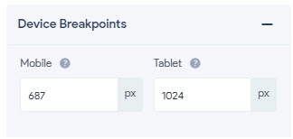
- Mobile – Lets you set�the breakpoint below which you want mobile menu
- Tablet – Lets you set�the breakpoint below which you want tablet menu
Animation Speeds
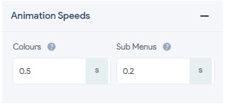
- Colors – Lets you specify the speed at which colors transition from standard to active or hover state occurs. You can set the color animation speeds in seconds
- Sub Menus – Lets you specify the speed at which the sub menus transition occurs. You can set the animation speeds in seconds
Technical
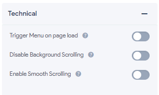
- Trigger Menu on Page Load – When enabled, this option the menu will appear in an expanded state when the page loads
- Disable Background Scrolling – When enabled, this option will disable the background page scrolling.
- Enable Smooth Scrolling – When enabled, the webpage will scroll smoothly to their target sections on the same page.
Page Overlay
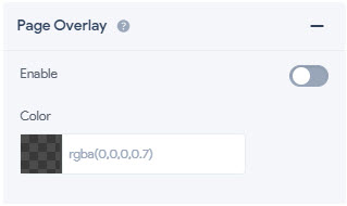
- Enable – When enabled, this option will add a page overlay on the background when the menu container is open, covering all but the opened menu and the menu button.
- Color – Lets you set the color of the page overlay. This field works nicely with a slight transparency.
Settings – Legacy Settings
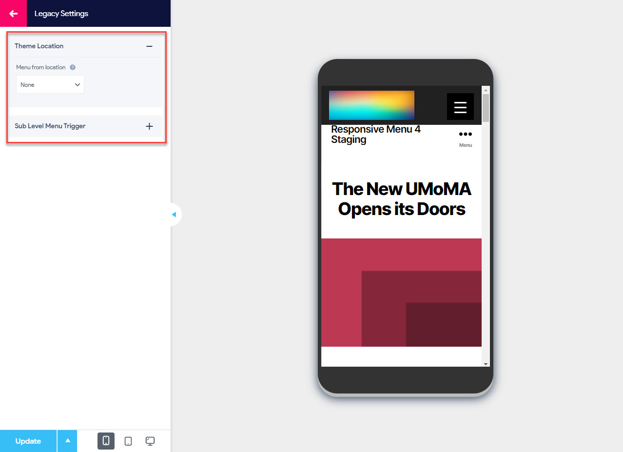
Theme Location
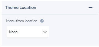
- Menu from location -� If you want to use a theme location menu rather than a specific menu then you can select from this drop-down
Sub Level Menu Trigger
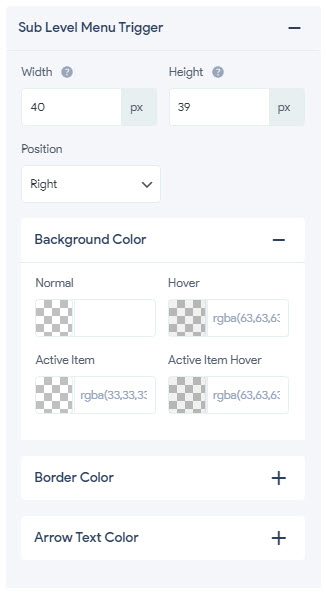
- Width – Lets you set the width of the menu trigger items. You can set the sub level menu trigger item width to any size in pixels(px), percentage(%), emphasize(em), root em(rem), viewport width(vw), viewport height(vh) units
- Height -Lets you set the width of the menu trigger items. You can set the sub level menu trigger item width to any size in pixels(px), percentage(%), emphasize(em), root em(rem), viewport width(vw), viewport height(vh) units
- Position – Lets you fix the position of the menu trigger item. You can define the position (either left or right) of the menu
Background Color
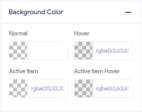
- Normal � Lets you set the normal/common background color of the sub level menu trigger item that is in an Idle position without any user activity. Set it to any color of your choice using the color picker.
- Hover � Lets you set the background hover color of the sub level menu trigger item that is in an Idle position. The background color of the Menu Trigger Text changes to the set color when the user hovers the cursor over it.� Set it to any color of your choice using the color picker.
- Active Item � Lets you set the background color of the Active Item that is in an Active position. It means when the sub level menu trigger item is in use the color changes to the set color. Set it to any color of your choice using the color picker.
- Active Item Hover � Lets you set the hover color of the Active Item that is in an Active position. It means when the user hovers the cursor over the active sub level menu trigger item the default color changes to the set color. Set it to any color of your choice using the color picker.
Border Color
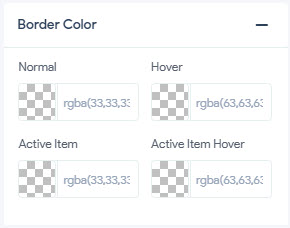
- Normal � Lets you set the normal/common border color of the sub level menu trigger item that is in an Idle position without any user activity. Set it to any color of your choice using the color picker.
- Hover � Lets you set the border hover color of the sub level menu trigger item that is in an Idle position. The color of the Menu Trigger Text changes to the set color when the user hovers the cursor over it.� Set it to any color of your choice using the color picker.
- Active Item � Lets you set the border color of the Active Item that is in an Active position. It means when the Menu Item is in use the sub level menu trigger item color changes to the set color. Set it to any color of your choice using the color picker.
- Active Item Hover � Lets you set the border hover color of the Menu Item that is in an Active position. It means when the user hovers the cursor over the active item the default sub level menu trigger item color changes to the set color. Set it to any color of your choice using the color picker.
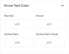
Arrow Text Color
- Normal – Lets you set the normal/common color of the arrow text when it is in an Idle position without any user activity.
- Hover -Lets you set the hover color of the Arrow Text that is in an Idle position. The color of the Arrow Text changes to the set color when the user hovers the cursor over it.
- Active Item – Lets you set the color of the Arrow Text that is in an Active position. It means when the Menu Item is in use the arrow text color changes to the set color.
- Active Item Hover – Lets you set the hover color of the Arrow Text that is in an Active position. It means when the user hovers the cursor over the active item the arrow text color changes to the set color.