
Turn Off Hamburger Menu on Desktop and Show Desktop Menu
With Responsive Menu Pro you can customize your site’s menu to its extreme. That much powerful this amazing plugin is if used correctly & responsibly. In this tutorial, we’ll explain to you how you can Turn off the Hamburger Menu Icon on the Desktop & rather show a desktop menu.
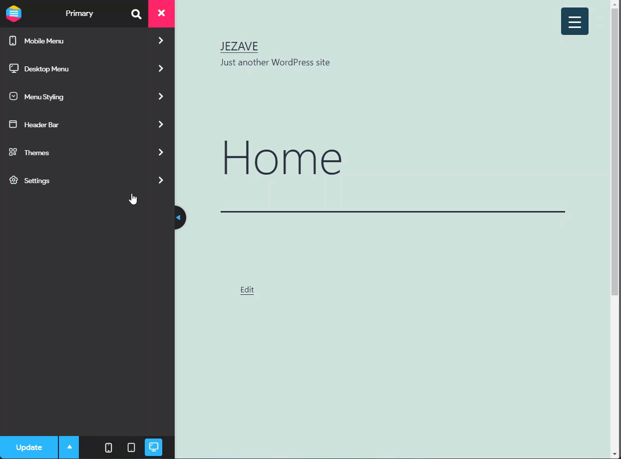
For this, we’ll be using the Responsive Menu Pro Plugin. Responsive Menu Pro unlocks the ability to create a Desktop/Menu & Header Bar and brings in more customization options. As for the sake of this tutorial we’ll be just dealing with the Mobile & Desktop Menu.
Step 1: Install Responsive Menu Pro
So, to begin with, You need to install & set up the Responsive Menu Plugin. If you haven’t here’s a quick tutorial on installing and setting up the plugin for first use.
Step 2: Setup the Device Breakpoints
After setting up the plugin, go to Customize > Settings > Advanced Settings. Here in the Device Breakpoints set the Tablet Breakpoint to 800 px to disable Hamburger Menu on Desktop. To disable the Hamburger Icon on Tablet screen sizes too, set the Tablet BreakPoint value to 700 px. Hit the Update button to see the changes.
Step 3: Setup the Menu width
The Hamburger Menu Icon will now be visible on your website’s menu. Next, we need to set up the Desktop Menu on your site. For this navigate to Desktop Menu > General Setup and add width. I’ve added width of 100% as seen below.
Now, we can enable all our menu items and create a Full-Fledged Mega Menu. We’ve discussed in this blog post how you can create a Mega Menu with the Responsive Plugin.